You are using an out of date browser. It may not display this or other websites correctly.
You should upgrade or use an alternative browser.
You should upgrade or use an alternative browser.
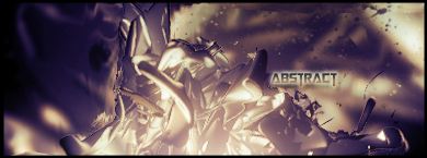
ABSTRACT SIG
- Thread starter IGnzo
- Start date
Im going to assume that you used this tut because it looks pretty similar.
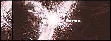
Well for my CnC the specs or stars or w.e looks really odd. Also the attempted blur at the edges to create depth needs a bit more work. The edges look WAY too blurred. Thats my opinion. The main thing is those little specks tho. Overall i like it, not bad keep it up.
okay i get what your saying


