- Forums
- XILED TEAMS
- DESIGN & EVENTS TEAMS
- DESIGN TEAM
- STORE EX-DESIGNER MEMBER THREADS (ADMIN ONLY HIDD
You are using an out of date browser. It may not display this or other websites correctly.
You should upgrade or use an alternative browser.
You should upgrade or use an alternative browser.
[ACCEPTED] KOG RAVE MASTER APP
- Thread starter Rave
- Start date
Snyder GFX
New member
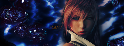
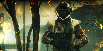
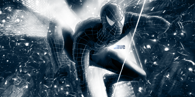
work on blending your render in ill send ya some tuts
Heres This Weeks Test Image
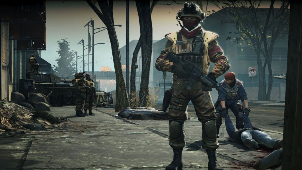
Also included with this image, I will provide you with a theme and you have to go out and find a stock and/or render to create a signature that represents the given theme.
When you are handing in your test images please make sure to provide the stock/render you are making the signature out of.
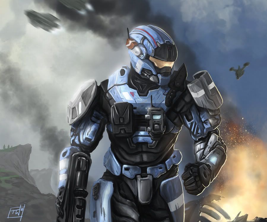
This weeks theme is : Halo : Reach!
Snyder GFX
New member
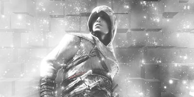
the first is a bit plain
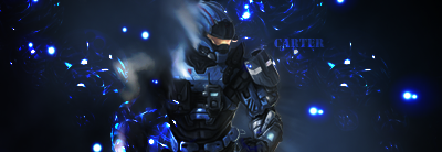
halo sig is nice need work on smudge i sent you something to help
halo sig is nice need work on smudge i sent you something to help
Snyder GFX
New member
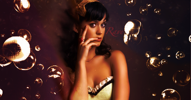
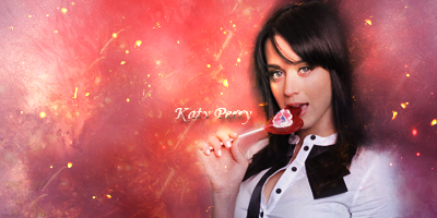
needs a stronger light source and smudge needs work i like the effects and colors
as far as katy perry shes hot but her music is so horrible lol
as far as katy perry shes hot but her music is so horrible lol
SYN Cheddarbob
New member
Hey there! I'm here to provide some extra test images to work on along with perfects! Just make a sig using this image! Get creative! Good luck!


Awesome job dude. I think this is a nice start to a signature but its just not finished yet. I think you should add more to the left side to get rid of the emptyness. An idea would be maybe start off by adding some space/star stocks and expand on them. (Go to google, bing, yahoo, anywhere and just look up space/stars and you should get some nice images) Another idea is maybe move your focal over just a little bit towards the center (rule of thirds).
As for your other images, I honestly think that those arn't your best works. Out of all your signature, your mario one is definitly your best. In all your other signatures (example, Katy Perry) you use the bubble effects, which is nice, but then the bubbles become overcontrasted and oversharpened. My advice to you would be if you are going to use bubbles, the only change you should make to them is colors ( don't contrast them or sharpen them). Another piece of advice would be to stay away from tutorials that make you sharpen/adjust contrasting for now because when you start to play around with that kind of stuff, it could kill a signature in seconds.
Otherwise, your doing a very nice job so far dude. Keep up the awesome work. If you need help in regards to finding tutorials, let me know because there are many websites out there that have tutorials that you could follow.
Snyder GFX
New member
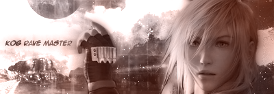
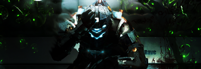
apply image extrude then erase to blend him in that way some of the effect is on him as well
even with that its a great tag good job
KIU
even with that its a great tag good job
KIU
Heres This Weeks Test Image
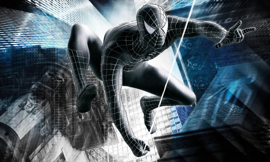
Also included with this image, I will provide you with a theme and you have to go out and find a stock and/or render to create a signature that represents the given theme.
When you are handing in your test images please make sure to provide the stock/render you are making the signature out of.
This weeks theme is : Music!
Snyder GFX
New member
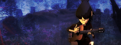
it dosent look like you did much with it
it looks good just plain try using different effects you guys love those bubbles lol
it looks good just plain try using different effects you guys love those bubbles lol
^^ Agreed.
Also the color is very monotone. You need to be able to use colors because many people who ask for signatures will ask for vibrant colors.
Also, like I said before, you need to work on your SATURATION, CONTRAST, and SHARPENING. With this, you should be able to balance out light and then all you have to do is ues dodge, for a start.

