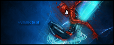
The flow is bad. You have what looks like a motion blur or smudge going from top left to bottom right of the render. And you have a bright *** blue c4d going from bottom right to top right. The bright blue you used doesn't go well. You should try using the darker blue on theleft of the Sig. Depth is iffy could be better. I like the text though get with me please and tell me how you do it. Also its kinda bare.


