- Forums
- XILED TEAMS
- DESIGN & EVENTS TEAMS
- DESIGN TEAM
- STORE EX-DESIGNER MEMBER THREADS (ADMIN ONLY HIDD
You are using an out of date browser. It may not display this or other websites correctly.
You should upgrade or use an alternative browser.
You should upgrade or use an alternative browser.
CAN I GET A LIL CNC
- Thread starter KoG KiLo69
- Start date
XGC Touch XS
New member
KoG KiLo69
New member
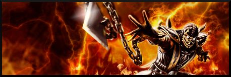
I imagine it's easier for the eye to come to rest on the spear rather than scorpion himself. Admitted that I didn't Incorporate any kind of flow to help pull the eye in that direction and can probably dial down the contrast to the back ground a bit.
XGC Touch XS
New member
I imagine it's easier for the eye to come to rest on the spear rather than scorpion himself. Admitted that I didn't Incorporate any kind of flow to help pull the eye in that direction and can probably dial down the contrast to the back ground a bit.
Im sure that would help. All in all tho it looks good. I will say you love using a fire aspect on signatures lol. Possibly we can run ideas off of each other as well.
KoG KiLo69
New member
Yea, kinda had to do a fiery feel to scorpion though. Thats his style lol. I can do fire easily, just have a problem with the contrast, it doesn't look as bright on my computer when I'm making them.

