CNC? #2

KoG Mufasa

New member
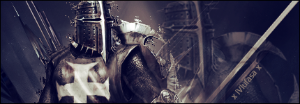
Knight_zpsf8ade2c3.png


Still having problems with text :/ I have always found it to be the hardest part lol.
 

IXssl

New member
I usually put the text as close to the Focal as possible on 12 ft but whatever looks good with the picture but also it looks like you put a dissolve filter around it I'm not really feeling it because you can see it in the background that it doesn't have the same effect on it as the focal. I honestly and this is just me that it throws it off and the one c4d on the right is just there I don't feel it goes with the flow you have already but like I said it's just me. But all in all you did a really good job
 

Jupiter

New member
The solid line on the right side takes away from any flow you had. I would get rid of that all together. For the font, I would place it right above the embellishment on his arm and play around with the color so it doesnt blend too much with that area. Nice job overall though.
 

KoG Mufasa

New member
agh! i forgot to erase some of the stuff behind the focal. that stuff behind the focal is a ripple layer and i meant to erase some parts around the left side and the head :/ as for the c4d, i was trying to do kind of a V around the focal but it didn't really work that way i guess.

Thanks!
 

IXssl

New member
By no stretch of the imagination is it not not good, its a very well made sig just a few minor tweaks and it's perfect. but I totally got what you were trying to do with the V just with c4d's it's either a hit or miss, either it'll work or it won't in this case it didn't but I got you on your vision.
 
Top