You are using an out of date browser. It may not display this or other websites correctly.
You should upgrade or use an alternative browser.
You should upgrade or use an alternative browser.
CNC FIRE SIG!!!!
- Thread starter XGC TOMMYGUN XC
- Start date
XGC TOMMYGUN XC
Community Leader
CNC this one as well as the fire sig below!!!


SYN Last Laugh
New member
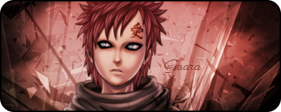
The only thing I can see is the text. Try to avoid putting text in the corners.
Second image won't load for me.
Second image won't load for me.
XDC KiLLaCam
New member
in the fire signature u need to make your focal more clear but that is a great render and a great sig and as far as the bottom one It is definatly the best one i have seen from yo yet i really like the color and flow... the only thing i wuld do to it is mabye go around the edges of your render with a soft brush eraser at 60% opacity to blend it in more but GREAT JOB 
Jupiter
New member
the text in the second one is a little hard to read maybe make it a tad bit darker. as for the first one i would move the text out of the corner i love the sig but the render is a tad bit hard to see but that is sort of how it should be you know? hes part of the fire. youre getting much better 
XDC KiLLaCam
New member
Yes i agree i was mistakin when i said you need to make your focal more clear... i didnt take into mind that it is supposed to be that way. you have good color skill and theme skill you just need to master the program you use and learn different ways to make a signature
XDC CHEF ZERO
New member
FIRST ONE> try not puting your text in corners, it cause the sig to become unbalance. also looks to be a tad bit over sharpen but not to much. all together nice work.
SECOND ONE> sift the render over to either side, rule of thirds, you want you render to be off kiltered not directly centered. the text is a bit hard to read.
But all together bro, your getting alot better, keep up the good work man.
SECOND ONE> sift the render over to either side, rule of thirds, you want you render to be off kiltered not directly centered. the text is a bit hard to read.
But all together bro, your getting alot better, keep up the good work man.
XDC KiLLaCam
New member
I agree completly you have shown a huge amount of growth

