You are using an out of date browser. It may not display this or other websites correctly.
You should upgrade or use an alternative browser.
You should upgrade or use an alternative browser.
CNC PLEASE!!!!
- Thread starter XGC TOMMYGUN XC
- Start date
XGC TOMMYGUN XC
Community Leader
Or not!!!!! LOL!!!!
Rave
New member
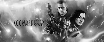
Try having more black and white in it. The signature right now is mostly grey and for Black & White art in general, you want mostly Black & White with some shades of grey. Besides that, I do like the effects that you used in this signature. Maybe strengthen the light source in the bottom right corner cause if you look on miranda's face, the left side of her face is lighter then the right. If you strengthen the light source there, it will help pull the signature in very nicely. These are just my own personal opinions. 
I L0v3 Anime
New member
Well, goood sig, I myself am a person that looks for color in everything though... lol
So my own opinion would be to have color, xD
Feel free to ignore it though
So my own opinion would be to have color, xD
Feel free to ignore it though
XGC Radioactive
New member
I feel like the background is lacking detail
I L0v3 Anime
New member
Well, could always add in some more stuff into the background... just add in some stuff and change the opacity on it. c:

