You are using an out of date browser. It may not display this or other websites correctly.
You should upgrade or use an alternative browser.
You should upgrade or use an alternative browser.
CNC PLEASE. (:
- Thread starter SYN Haze
- Start date
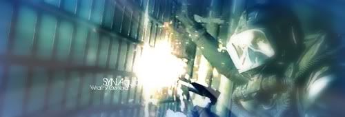
The text is hard to see/read on all of them.
Aside from that, theyre a bit plain.. try working with more effects such as fractals, space/star stocks, etc..
texture stocks such as.. cracked walls/earth, crinkled paper, etc..
okay, thanks
One of the biggest things that i can see is that the focal points are all wrong...take the third one for example...you blurred out the person but not the gun...so your eyes automatically go to the gun first and then to everything else.
Like everyone else has said they are simple and the text is really hard/ impossible to see...text can make or break sigs...good work though just try next time to make a focal point better.
Like everyone else has said they are simple and the text is really hard/ impossible to see...text can make or break sigs...good work though just try next time to make a focal point better.
Mmhmm,not bad it seems like you got a decent sense of depth
but like everyone else said,it could use some more effects.
the first one i can understand you dont really need anymore on that one.
you acheived some good underwater welding effects
the 2nd one,def could get scraped,composition (the way stuff's layed out)
is badddd,flow is baaad,render's not blended a bit,and colors arent quite coordinating.
the 3rd one,not bad,nor great>in a simplistic style its more good then bad
it looks like you were trying for lighting and depth,which are both done decently imo.
yeah you got the person blurred>but i think of when someones pulling a gun on you
will you look at their eyes or the barrel of the gun? i would think gun,so kudos on that
you text on all of em,i suck with text so i just leave it out
but thats all your call,kiu buddy


