CNC TAKE IT EASY ON ME I NEED HELP

I COULD USE ALOTA HELP BUT WORKED ON THESE FOR A LIL WHILE ( NEED HELP BLENDING THE PICS N WHAT NOT AND TEXT)


!
smokey2-1.png

MaYHaM.png


START:

1024.jpg


1024.jpg


1024jj.png


FINISH
seakdonkey.jpg


text i have done
276972728.gif

12012625.gif

138993174.gif

34631577.png

30286995.gif

hh237705343.gif
 
Last edited:

IGnzo

New member
okay well the best way that i know of to blend is smudging 100% of the time it will look good if you know what your doing! lol but it you click here you will be able to learn smudging alot better!

Now for text i use http://www.dafont.com/
 

IGnzo

New member
your doing good for a beginner its just of course the blending and try to have only one focal not 2 or 3. it gets distracting. going on deviantART they have alot of tutorials for photoshop or also google!!
 

Rave

New member

These will help you grasp and build upon the basics of photoshop.

As for CnC... I would recommend staying away from using multiple vocals as it tends to lead the eyes astray. Also, Keep your text near each other and avoid putting it in corners. The reason you do not want it in corners is because it will distract people's eyes away from your focal.
eazyg.png

You see how Gonzo has his text near superman? It leads your eyes to the focal. (Hope you don't mind me using your sig as an example Gonzo).

For a beginner, you are doing pretty good; just keep practicing and doing tutorials and you will gradually get better.
 

Lawlz

New member
The big thing that you need to know is, less is usually more. Once I learned that my work started looking more professional instead of thrown together and all over the place.
 

XGC TOMMYGUN XC

Community Leader
That Panther is your best one yet!!!!! HECK of a lot better!!!! Like I said before though, text is probably the hardest thing to make look good in a sig!!!! Maybe a little smaller text and bring it in a little more......Keep practicing
 

Lawlz

New member
Rave's tut would be great for you, very easy to understand and a lot of good techniques for you to learn.

This took 10 minutes following the tut exactly:
Tut1.png


This is what I did with it after to add my own style:
Tut2.png


It's usually better if you don't put too much thought into a sig because it can start to fill up with several different ideas. My motto is "keep it simple, stupid!"
 

Rave

New member
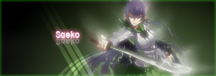
Here is my version of that tut. It's a very rushed job of it cause I didn't have the time to work out the kinks in it. I did add my own touches to it.

Saeko.png
 
Top