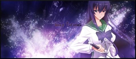
Personally I just think it is the flow f*ing things up. This is because you've chosen a render which has such obvious directional flow and you've gone against it. She is unsheathing her sword, and when looking at images our brain tends to perceive movement - yet the light which is spiking to the right is going completely against the direction of her sword - left. This kinda makes the whole image confusing to look at, as our eyes don't know where to focus.
I think it would be okay as a simple signature if the flow issue was corrected.


