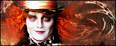
1. I love the Mad Hatter signature. The text is a little thin so it's hard to read, but thats about all I can think of.
2. I'm a fan of "darker" signatures such as this one, so that gives you points lol. Iron Man is centered, try avoiding that. Your flow seems to be going in too many different directions. The text seems a bit blurry. I like what you did with the lighting, how it seems to come down in rays, instead of the standard ball of light.
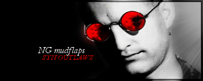
3. It's a bit plain, but that could be the look you were going for. I can't put my finger on it, but something is off with your render. He's either not sharpened enough, or seems a bit stretched, I'm not positive which one. The lighting is kind of weird on the render, too, (the left side of his glasses being lit up) so I'm not sure what you would do about that. I like the color scheme of black and white, with the red glasses thrown in.
4. Like Snowfall said, it's a bit monotone but I like it as well. I would maybe up the brightness and then up the contrast a bit. It may make a bigger difference than you think. It has good flow, imo. As far as the "border that shouldn't be" I'm not sure how gimp works, whether its like photoshop where you can make an entire layer a gradient, or if you have to stretch it across yourself, but if you have to stretch it across yourself, you probably didnt stretch one of them far enough across.
5. I like your buttons, lol. But some of the "Click here"s seem slightly off centered.


