You are using an out of date browser. It may not display this or other websites correctly.
You should upgrade or use an alternative browser.
You should upgrade or use an alternative browser.
CNC
- Thread starter K7own
- Start date
XGC TOMMYGUN XC
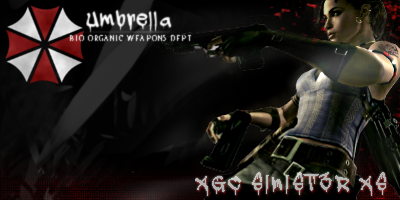
Community Leader
Yea!!!! I would definitely get the texts out of the corners and off of the focal!!! also that umbrella thing is really distracting from the focal, maybe try lowering the opacity and blend it in a little and drop it down away from the corner!!! also try blending in the focal (girl) a little, if you look you can see some really sharp edges around her arms and around the guns!!! I do like where the whole thing is going!!! Those are just my suggestions!!! lol

