You are using an out of date browser. It may not display this or other websites correctly.
You should upgrade or use an alternative browser.
You should upgrade or use an alternative browser.
COUPLE NEW ONES
- Thread starter Sicafoose
- Start date
Rave
New member
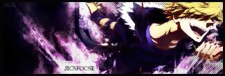
For the bottom one, I don't like the placement of the focal. Since he is in a running motion, he should have more room in the direction he is running.
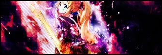
As for the top one, I'm not a fan of the negative space on the right side of the signature. Also, try straightening the text in the top one.
As for the top one, I'm not a fan of the negative space on the right side of the signature. Also, try straightening the text in the top one.


