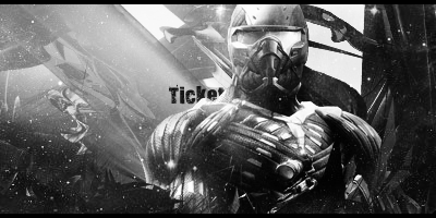
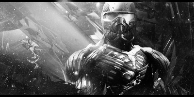
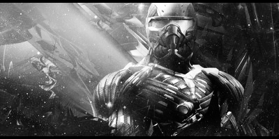
Looks good, but I'm not a huge fan of the background. I would've gone with a realism background stock with that render.
I think the text would look better not semi-hidden by the guy. I like that effect—I use it every now and then—but it doesn't look right with this tag. The font you have now has boldness, but it's not simple. A more simple, yet bold font would do nicely.
You know though, text is optional in a tag—if you're not giving the text an art and style of its own. If I were designing this tag, I think I would have left out the text altogether.
