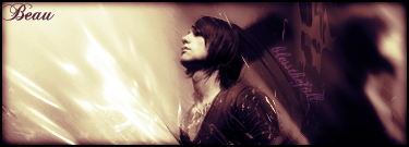
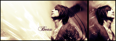
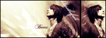
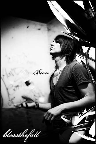
I agree about the light being divided here, I'm not sure I mind it, but the flow might be less interupted if you try to bring some of that light across the upper portion of the sig. I would add something darker in the upper left portion of it, as well. When there's that much light it looks bland and empty.
Also, to bring in some of that light, and make things more readable, change the text behind him to that lighter yellow color. You may also want to choose a more legible font for it. I can't even tell what it says. I mean, I know, from the thread title, but I can't READ it.
I also agree the other text is too far from the image. Bring it closer to him, to the left of the base of his neck or somewhere near there.
