- Forums
- XILED TEAMS
- DESIGN & EVENTS TEAMS
- DESIGN TEAM
- DESIGN TRAINING GROUNDS
- TRAINING GROUNDS HISTORY
You are using an out of date browser. It may not display this or other websites correctly.
You should upgrade or use an alternative browser.
You should upgrade or use an alternative browser.
DRAGON WEEK #69
- Thread starter XGC Dragon Skin
- Start date
KoG KiLo69
New member
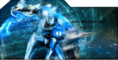
Looks good bro I'm doin multiple drafts cause I can't decide how I want it to look then ima pic one n post it up but after seein this ima have to go back to the drawingboard lol
CAPOS SNOW
New member
What did you do besides the border? What program do you use?
XGC TOMMYGUN XC
Community Leader
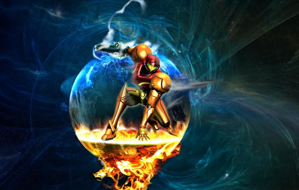
This doesnt blend well at all, you have a orange, red and yellow focal and then a blue background......there is no colors from the focal in the background at all and no colors in the background in the focal to bring these 2 images together, it actually look like its 2 separate images slapped together. Also your flow is off, you have this smokey fog like thing across your focal and then a wisp thing from the planet that totally conflict with eachother......the flow lines of the both of them go in the complete opposite direction. I do like the concept you were trying to go!! Hopefully this helps
XGC Dragon Skin
New member
XGC Dragon Skin
New member
XGC Dragon Skin
New member
XGC TOMMYGUN XC
Community Leader
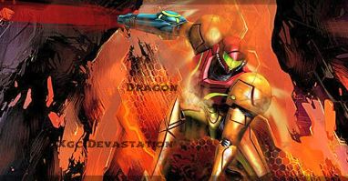
I do really like the orange sig the best, lol but yea that kinda what I was getting at!! Me personally, I like to keep a lot of the color still in it and tint it with blue......but like I said totally changing the color is an option also!!

