- Forums
- XILED TEAMS
- DESIGN & EVENTS TEAMS
- DESIGN TEAM
- DESIGN TRAINING GROUNDS
- TRAINING GROUNDS HISTORY
You are using an out of date browser. It may not display this or other websites correctly.
You should upgrade or use an alternative browser.
You should upgrade or use an alternative browser.
DRESDEN'S WEEK #69
- Thread starter XDC Dresden
- Start date
XDC Dresden
New member
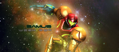
I really had trouble with the text on this one. I'll revisit these later and see if I can fix the text a bit.
CAPOS SNOW
New member
I'm not a fan of the outer glow on text. I would tone it down on the samus and change the color of the glow to a mustard color. The outer glow on the week 69 is perfect. It accents the text perfectly. The background Kinda reminds me of this one


Last edited:


