FIRST IN A LONG LONG TIME

CAPOS SNOW

New member
be as critical as you want. i dont even know when was the last time i attempted one of these


bf1%203_zpswf2s0m3g.jpg
 
Last edited:

TheRealMrNUGGET

New member
be as critical as you want. i dont even know when was the last time i attempted one of these


bf1%203_zpswf2s0m3g.jpg


I can't really CNc details because I'm on my phone right now, but one thing that might look good is if you move the character to the left more. It would help draw more focal via rule of thirds.
 

TheRealMrNUGGET

New member
be as critical as you want. i dont even know when was the last time i attempted one of these


bf1%203_zpswf2s0m3g.jpg

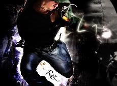
ok, so im looking at it on the laptop now and there's a lot i like, but also some areas i feel need work. the colors are great, and the idea is great, but there are still three big things i see, the text the effects and the lights. the effect in the bottom right is cool and works well, but it gets lost in the render. i would suggest trying to enlarge the effect to try and compensate. the effect going across the top also bothers me, this being because it doesnt work with the flow of the sig. that area of the sig looks more like a vertical flow than a horizontal flow like the rest of the image. if you add a motion blur to that area it may add just enough horizontal flow, and may still show the effect if you change the opacity. the lighting is simple, but crucial on all images. try to throw in some white and black overlays to try to make your sig really pop!
 

CAPOS SNOW

New member
ok, so im looking at it on the laptop now and there's a lot i like, but also some areas i feel need work. the colors are great, and the idea is great, but there are still three big things i see, the text the effects and the lights. the effect in the bottom right is cool and works well, but it gets lost in the render. i would suggest trying to enlarge the effect to try and compensate. the effect going across the top also bothers me, this being because it doesnt work with the flow of the sig. that area of the sig looks more like a vertical flow than a horizontal flow like the rest of the image. if you add a motion blur to that area it may add just enough horizontal flow, and may still show the effect if you change the opacity. the lighting is simple, but crucial on all images. try to throw in some white and black overlays to try to make your sig really pop!

Hey thank you. I appreciate it!
 

SYN Jordan XD

Administrator
be as critical as you want. i dont even know when was the last time i attempted one of these


bf1%203_zpswf2s0m3g.jpg

Oh wow. Not sure how i missed it. Ok, i agree with the comment nugget made on image placement and relation to the text and focal. Placements on this design draw my eye in 2 separate areas. And leaves alot of open real estate on the left. Personally, i would have desaturated it a little bit for adjustment. And also maybe a gradient map to match the render with background slightly more. And the right side of render's face is overcast, and the effects that are on bottom right side of sig give no indication of a presence of shadow. All i can think of.
 
Top