azdahebrewhamr
New member
if your familiar with a designer named xprophet... i dled his psds and i freakin love his style. Its very technical and takes a long time, but its worth it. I based these off of his work... looks like i found a new style eh? 

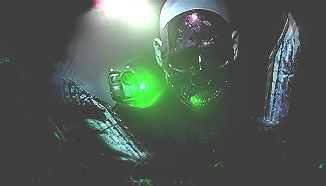
I dont like this one as much... but still not bad. Color blending needs work and there is a bit too much emptyness. aaannd the quality is ****

And heres the abstracts ive done recently using a new method i came up with.


you can Cnc if you want.

I dont like this one as much... but still not bad. Color blending needs work and there is a bit too much emptyness. aaannd the quality is ****

And heres the abstracts ive done recently using a new method i came up with.


you can Cnc if you want.

