- Forums
- XILED TEAMS
- DESIGN & EVENTS TEAMS
- DESIGN TEAM
- DESIGN TRAINING GROUNDS
- TRAINING GROUNDS HISTORY
You are using an out of date browser. It may not display this or other websites correctly.
You should upgrade or use an alternative browser.
You should upgrade or use an alternative browser.
KILO WEEK #69
- Thread starter KoG KiLo69
- Start date
CAPOS SNOW
New member
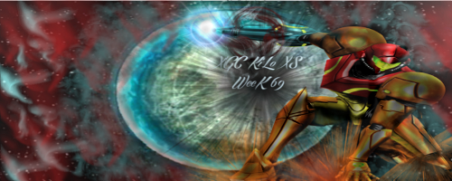
The only part that the render seems to blend with the background is the right arm, and the thumb on the left hand. Your texting as well does not blend with it. Are you using gimp? Try using backgrounds with higher resolution and not taking an image and expanding it. The background has a lot of mess. If it was me I would cut down on the size of the signature until I was able to handle something bigger. If by chance you are using photoshop try this tutorial. http://browse.deviantart.com/art/Samus-Sig-Tutorial-85999366 it uses the same character you are using already so your render will work great.
KoG KiLo69
New member
Thanks Rez, I actally chose a bigger background and down sized it cause I agree I hate stretching images then worked from there but am slowly learning. I also dont know how to make the text blend better other than changing the color. im using gimp if u have some pointers for that
CAPOS SNOW
New member
I knew you did something to the size. Heh
Some of the aspects of your text are good. Like keeping it close to the render but personally I do not think the font works
http://browse.deviantart.com/art/Text-Tutorial-For-Making-Sigs-161080206
dafont.com
in the quick time I looked I could not find a blending tutorial, but I'll keep my eye out
Some of the aspects of your text are good. Like keeping it close to the render but personally I do not think the font works
http://browse.deviantart.com/art/Text-Tutorial-For-Making-Sigs-161080206
dafont.com
in the quick time I looked I could not find a blending tutorial, but I'll keep my eye out
KoG KiLo69
New member
Alright thanks bro keep the info coming lol. Do u think if I changed the reddish part to the bright orange of his armor would that help and change the blue to the reddish color think that would help it blend and look good and while im at it change the font?
Last edited:
KoG KiLo69
New member
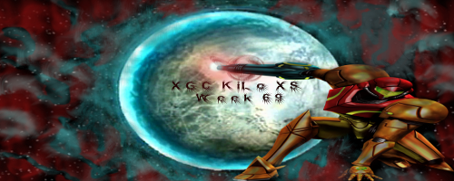
I edited the pic up top tell me does she blend in a lil better now? I didn't change the font caue I forgot so ignore that
XGC TOMMYGUN XC
Community Leader
Yea just like I had told you last week Dont use white in text!!! The only way I MIGHT use white text is if the sig was a Black and white sig or the majority of the sig was white.....on these darker sigs, white text sticks out like a sore thumb!!! Aslo your flow, if you were to follow the lins of any image on a sig, it should hardly ever cross another line of another image.......hope that makes sense!! On your sig you have lines crossing lines crossing lines everywhere!! lol. Most of the time simple is better....If you try to add to much it makes the viewers eyes go all over the place which isnt very pleasant to view!! Hope this helps!!
KoG KiLo69
New member
I used the color picker to try to make my text the same color as the planet and that's the color it came out as its like really light blue but qi got what u sayin. And u mean the red lines over lapping the planet and stuff right is that what u mean by lines goin over another image? Just using it as example
XGC TOMMYGUN XC
Community Leader
Yea the light bursts are one example and actually a very good example, Im pretty sure thats what they are called.....I would try not to use more than 1 light burst in a sig just cause of the fact that they have line going everywhere and it is very easy th throw off the flow!!
KoG KiLo69
New member
Ok so other than the rays from the light burst and the Aurora goin over the planet and my font color and choice what do u think
KoG KiLo69
New member
SYN MsTwiztid
New member
When working with backgrounds, you should use colors from your render.
KoG KiLo69
New member
The reddish Aurora is the same as his helmet n chest plate. The blue was from the planet, would it be better if I turned it orangeish or yellow? So other than my color choice what do u think
XGC TOMMYGUN XC
Community Leader
Hey Kilo how long have you been using GIMP??
I can tell you are really trying, Thats good!!!just remember its not all going to come together over night!! You need to start with the basics of your program (GIMP) Things like re sizing and keeping perspective, masking, color adjustments, layer styles ect, ect..... It looks like when you re sized the render you lost perspective on it!!! TEXT is a lot better just be careful you dont get too fancy with it!!! I know you will be getting a lot of different feedback coming at you and you dont have to get it all right at once, just take 1 or 2 thing and work on them till you have it down!! Then move on to the other feed back you get.....just dont get discouraged, we are here to help you get to where you want to be as a designer!!
I can tell you are really trying, Thats good!!!just remember its not all going to come together over night!! You need to start with the basics of your program (GIMP) Things like re sizing and keeping perspective, masking, color adjustments, layer styles ect, ect..... It looks like when you re sized the render you lost perspective on it!!! TEXT is a lot better just be careful you dont get too fancy with it!!! I know you will be getting a lot of different feedback coming at you and you dont have to get it all right at once, just take 1 or 2 thing and work on them till you have it down!! Then move on to the other feed back you get.....just dont get discouraged, we are here to help you get to where you want to be as a designer!!
KoG KiLo69
New member
Trust me ZERO discouragement here. I've been using gimp since last week. Know I got a lot to learn on what some stuff does. When I resized the render on this on I realized I messed up a bit after it was way too late. But one thing I'd like to know is if I'm improving, ima do one more runof this render n put it up here. I'll try to fix all problems.
Last edited:
KoG KiLo69
New member
XGC Dragon Skin
New member
It is getting better. Just advice to leave the original image alone other than the edges to blend in. The background just play around with it then throw the image over it.
KoG KiLo69
New member
I didn't really mess with the render I resized it and put a very light layer of black over it to help it blend with the rest rather than him being too bright and sticking out too much. That's what I did was make my background and put him on there then make adjustments. But thanks and yall keep the info coming give me whatever ya got I spent alot of time on this one
XGC Dragon Skin
New member
Tell me about it. LOL. I am almost tired of looking at the same photo. I have probably 12 hours into those two sigs. The first one I spent about 4 hours on and the second 8.
KoG KiLo69
New member
Dang, well I ain't spend that much time Prolly 3 hours total. I'm thinkin of doin one with venom on my free time


