- Forums
- XILED TEAMS
- DESIGN & EVENTS TEAMS
- DESIGN TEAM
- DESIGN TRAINING GROUNDS
- TRAINING GROUNDS HISTORY
You are using an out of date browser. It may not display this or other websites correctly.
You should upgrade or use an alternative browser.
You should upgrade or use an alternative browser.
KILO WEEK #70
- Thread starter KoG KiLo69
- Start date
XGC Dragon Skin
New member
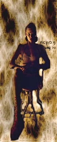
It isn't a bad sig Kilo I like the use of the rear background. Shows you are starting to use layers. I always use the lasso cut out tool to cut out my image of choice. I never use the original backgrounds. After cutting it out I transfer it to another new background. On the background options there is an advanced section for transparent backgrounds. I work on transparent's with every major change or idea on a new transparent background.
Just try cutting her out and putting her on new transparent background. Next spend time with the cutout erasing any noticeable edges in preparation for attaching it to new background. Find a background with similar color schemes or themes. If the color don't match perfectly find another image and addition or grain merge it to rear background to change tones and colors of the sig.
Just try cutting her out and putting her on new transparent background. Next spend time with the cutout erasing any noticeable edges in preparation for attaching it to new background. Find a background with similar color schemes or themes. If the color don't match perfectly find another image and addition or grain merge it to rear background to change tones and colors of the sig.
KoG KiLo69
New member
I actually made that background myself didn't search up a thing. then cut her out of he pic and put her in and made some additional changes and this is what I came up with lol. The background is Prolly a lil much but ill gather info and go again
Last edited:
KoG KiLo69
New member
Anyone else got some more info
XGC TOMMYGUN XC
Community Leader
You can use a little work on rendering (cutting out the image) you can really notice poor rendering at the bottom with the chair legs ans feet!!! Also it is very plain!! You have your render and a background and thats it!!! Add some effects, c4ds..... Someting to give your background some more depth!!
KoG KiLo69
New member
Thanks tommy also what info can u give me on my current Sig I'm going to continuously work on it until its perfect
SYN MsTwiztid
New member
Hey Kilo!
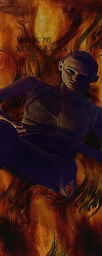
I'm excited about you interest in designing. First thing i would suggest is working on your sizing and placement of your focal. She is really small in the space and is oddly placed. In vertical sigs it's kind of hard to do placing, or at least it is for me.
One thing you want to keep in mind is your Rule-of-thirds. The rule suggests that an image should be imagined as if it were divided into nine equal parts by two equally-spaced horizontal lines and two equally-spaced vertical lines, and that important compositional elements should be placed along these lines or their intersections.
(If you need further help understanding rule-of-thirds, let me know and i'll try to dig up an old post of mine where i spent some time explaining it.)
KoG KiLo69
New member
SYN MsTwiztid
New member
The slant is really bad. >.<
KoG KiLo69
New member
Do u think I should of left her straight up sitting in her seat? I went for the falling into fire look lol
SYN MsTwiztid
New member
Yea, definitely should have kept her straight. Also, when you are scaling your images, are you locking the proportions so that they don't stretch out weird?
KoG KiLo69
New member
I don't think so. But will remember to do so from now on, also what info can u give me on my current sig
KoG KiLo69
New member
SYN MsTwiztid
New member
Much better.
XGC JO3 D33R XC
Administrator
ghostly


