NecroWhuut
New member
WARNING BAD SPELLING/GRAMMAR do your best to understand what im trying to say as i am too lazy to edit right now. any questions feel free to ask...
So adjustment layers were always a big mystery to me when I was starting out and i can assume they are the same to all of you who read this. I know some of you "know" how to use them, but do you really know or do you simply know how to use them in one and only one way. I see a lot of gradient maps on soft light, and yes its cool how you can make all the colors in the rainbow fit into only 2 that's not what they are there for. When you create something you should already have a color palette in mind(normally taken from the colors on the focal) and with this color palette you manipulate the colors of your other resources to fit into your "idea".
The first step is to take a look through this tutorial:
click me
Now download this psd to go through the layers as i explain my uses for them:
click me
although it doesn't show you how these apply to sig making for techniques to use them it shows you what everything does. I could have made my own version of this but i would have left some out that i don't use and wouldn't have done as good a job as what is available.
My techniques to using adjustment layers are focused on little changes. if you rely on one layer to change your sig to much than your work will be one dimensional. if you use a lot of different types to change this little by little you learn more about each one and you soon find out how to control the mystery of adjustment layers.
Below are some screens of a few of the key layers i used in this tag:

ill explain why i used each and every one and how they changed the look of the tag.
Levels:
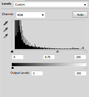
When i use levels i aim to unify the blacks. Have you ever had a tag that had many many different shades of dark colors that made the tag look busy? well if you use my settings you'll see that a lot of these "busy" areas end up being all the same shade of black. the bottom slider is used to brighten the blacks because when using the top bar to unify the blacks it ends up making the entire tag darker. by sliding the left arrow a bit towards the center you end up making the black approach a more grey shade. Depending on how much you move it you can choose how bright/dark you want the darkest parts of the tag to be.
Curves:
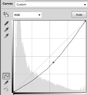
I use the curves tool to try to get the lighting to look as accurate as i can, it changes the brightness and darkness of things. my simple rule of thump is, above the grey straight line is brighter below it is darker. It helps "set the mood" and makes everything look more realistic.
Gradient Maps:
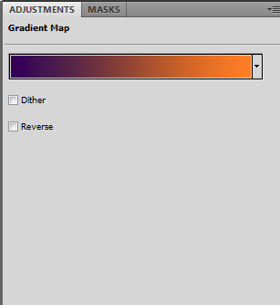
When i use gradient maps i use them on lighten mostly, which means that whatever color that is on the left will now be the color of all the dark parts of the tag. Some nice colors to use are purple, blue and red. I put this layer to a low opacity, often changing depending on the look i want.
black and white (either the seperate adjusment or as a gradient) can be put on luminosity to make some tags have a more realistic look.
Hue/Saturation:
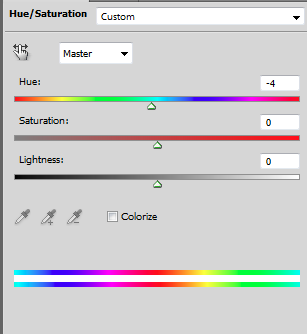
This layer i use in two ways
1: in a clipping mask to change the color of a c4d of any resource i want to fit into my color scheme
2: to rotate all the colors around the color wheel a few shades
my 2nd use for this is more just experimentation, i just see if it looks better and if not oh well if so, awesome!
Brightness Contrast:
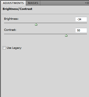
this layer i use hand in hand with curves to set the brightness and darkness of the tag, the use is fairly obvious i feel, but my basic technique is just experimentation until i get as close to realistic as possible.
there are many different ways to use adjustment layers so don't think my uses are all of them, many people use them many different ways, but for the most part any tag with good adjustment layers will look better than ones without.
TLDR They make everything you do look a million times more professional & way better
So adjustment layers were always a big mystery to me when I was starting out and i can assume they are the same to all of you who read this. I know some of you "know" how to use them, but do you really know or do you simply know how to use them in one and only one way. I see a lot of gradient maps on soft light, and yes its cool how you can make all the colors in the rainbow fit into only 2 that's not what they are there for. When you create something you should already have a color palette in mind(normally taken from the colors on the focal) and with this color palette you manipulate the colors of your other resources to fit into your "idea".
The first step is to take a look through this tutorial:
click me
Now download this psd to go through the layers as i explain my uses for them:
click me
although it doesn't show you how these apply to sig making for techniques to use them it shows you what everything does. I could have made my own version of this but i would have left some out that i don't use and wouldn't have done as good a job as what is available.
My techniques to using adjustment layers are focused on little changes. if you rely on one layer to change your sig to much than your work will be one dimensional. if you use a lot of different types to change this little by little you learn more about each one and you soon find out how to control the mystery of adjustment layers.
Below are some screens of a few of the key layers i used in this tag:

ill explain why i used each and every one and how they changed the look of the tag.
Levels:

When i use levels i aim to unify the blacks. Have you ever had a tag that had many many different shades of dark colors that made the tag look busy? well if you use my settings you'll see that a lot of these "busy" areas end up being all the same shade of black. the bottom slider is used to brighten the blacks because when using the top bar to unify the blacks it ends up making the entire tag darker. by sliding the left arrow a bit towards the center you end up making the black approach a more grey shade. Depending on how much you move it you can choose how bright/dark you want the darkest parts of the tag to be.
Curves:

I use the curves tool to try to get the lighting to look as accurate as i can, it changes the brightness and darkness of things. my simple rule of thump is, above the grey straight line is brighter below it is darker. It helps "set the mood" and makes everything look more realistic.
Gradient Maps:

When i use gradient maps i use them on lighten mostly, which means that whatever color that is on the left will now be the color of all the dark parts of the tag. Some nice colors to use are purple, blue and red. I put this layer to a low opacity, often changing depending on the look i want.
black and white (either the seperate adjusment or as a gradient) can be put on luminosity to make some tags have a more realistic look.
Hue/Saturation:

This layer i use in two ways
1: in a clipping mask to change the color of a c4d of any resource i want to fit into my color scheme
2: to rotate all the colors around the color wheel a few shades
my 2nd use for this is more just experimentation, i just see if it looks better and if not oh well if so, awesome!
Brightness Contrast:

this layer i use hand in hand with curves to set the brightness and darkness of the tag, the use is fairly obvious i feel, but my basic technique is just experimentation until i get as close to realistic as possible.
there are many different ways to use adjustment layers so don't think my uses are all of them, many people use them many different ways, but for the most part any tag with good adjustment layers will look better than ones without.
TLDR They make everything you do look a million times more professional & way better
Last edited:
