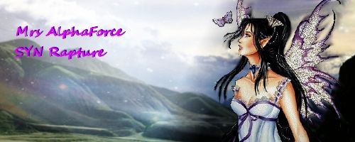
the first one the font would be less distracting if it was closer to the fairy and maybe a tad bit smaller. also the colors of the background are pale compared to the fairy herself so they differ quite a bit when placed together. a way you could fix this is with gradient maps or even just playing around with the contrast & brightness of the background to give it a more vibrant look.


