You are using an out of date browser. It may not display this or other websites correctly.
You should upgrade or use an alternative browser.
You should upgrade or use an alternative browser.
NEWEST SIG CNC
- Thread starter XDC Dresden
- Start date
Rave
New member
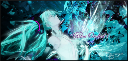
There's a few things wrong with this signature.
1) Her body is too bright. Try burning her shirt and face some.
2) I don't see your flow in this signature. I just woke up but I'm pretty sure it's not there.
3) The outer glow that you placed around your text is a little too bright also, you might want to decrease the opacity on it.
4) The color of the text doesn't really work in my opinion with this signature. I can see that you pulled the color from the ribbon in her hair.
5) I think I see where your lighting is but I'm not 100% sure of where it is.
6) Your watermark is way too noticeable.
Keep up the good work and let me know if you need any help.
(Hopefully I don't sound like a complete a-hole here)
XDC Dresden
New member
Gee thanks. And I was really proud of this one 
Last edited:
XDC Dresden
New member
2) I don't see your flow in this signature. I just woke up but I'm pretty sure it's not there.
? No flow?
5) I think I see where your lighting is but I'm not 100% sure of where it is.
? You can't see where the lighting is?

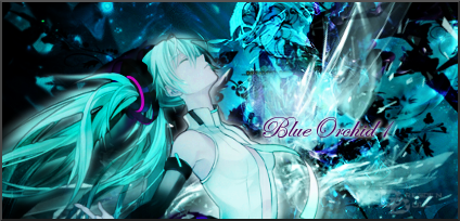
There, I tweaked it.

? No flow?
5) I think I see where your lighting is but I'm not 100% sure of where it is.
? You can't see where the lighting is?

There, I tweaked it.

