- Forums
- XILED TEAMS
- DESIGN & EVENTS TEAMS
- DESIGN TEAM
- DESIGN TRAINING GROUNDS
- TRAINING GROUNDS HISTORY
You are using an out of date browser. It may not display this or other websites correctly.
You should upgrade or use an alternative browser.
You should upgrade or use an alternative browser.
PHANTOM WEEK # 4
- Thread starter XGC Phantom
- Start date
Jupiter
New member
Alright, lets see..
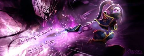
Flow - Not too bad but you do have a few spots in your background that conflict with it and completely throw it off. The main spot being the lines going straight up and down as opposed to following her movement. Other than that, the rest seems to move well with her. Nice job on that.
Lighting - You have light coming from all around and you even have a bit of a glow around her entire body. Try to pay attention to the light spots and the shadows of the focal. Darken the areas where the shadows are and have some subtle light areas where the light spots are. Sometimes it can be difficult to find these but youve just gotta look Also, lighting can also be over-done so try to avoid that.
Text - Im not really feeling the text. Im thinking its more of a font issue really. I would have chosen more of a "sharp"font such as "Abaddon" or even "Pirulen". If you dont have much of a selection of fonts, check out dafont.com. they have a ton!
Depth - Always try to remember this as it can greatly improve a signature. You have spots in your background that are just as focused as your focal is. This can hurt a signature as your eye is normally drawn to the more focused areas and if you have a lack of depth, then you're looking all over the place.
I definitely like the direction you took, just need some tweaks
Thank you for participating this week as well! I appreciate it.
Flow - Not too bad but you do have a few spots in your background that conflict with it and completely throw it off. The main spot being the lines going straight up and down as opposed to following her movement. Other than that, the rest seems to move well with her. Nice job on that.
Lighting - You have light coming from all around and you even have a bit of a glow around her entire body. Try to pay attention to the light spots and the shadows of the focal. Darken the areas where the shadows are and have some subtle light areas where the light spots are. Sometimes it can be difficult to find these but youve just gotta look
Text - Im not really feeling the text. Im thinking its more of a font issue really. I would have chosen more of a "sharp"font such as "Abaddon" or even "Pirulen". If you dont have much of a selection of fonts, check out dafont.com. they have a ton!
Depth - Always try to remember this as it can greatly improve a signature. You have spots in your background that are just as focused as your focal is. This can hurt a signature as your eye is normally drawn to the more focused areas and if you have a lack of depth, then you're looking all over the place.
I definitely like the direction you took, just need some tweaks
Thank you for participating this week as well! I appreciate it.
XGC Phantom
New member
Better??


Jupiter
New member
Yes, much. My eye is drawn to her now instead of everything going on in the background. The text looks a little rigid though it may just be the font itself, they do that when turned diagonally sometimes.
My last suggestion would be to use your dodge tool, set it to 60px - hardness 0%, a standard circle works for the brush shape, Range - Midtones, Exposure - 50%, and make sure to check "protect tones". lightly drag it over the highlights on her face and chest just to bring them out a bit.
Other than that, I feel this is a huge improvement from the previous version, good job!

