- Forums
- XILED TEAMS
- DESIGN & EVENTS TEAMS
- DESIGN TEAM
- DESIGN TRAINING GROUNDS
- TRAINING GROUNDS HISTORY
You are using an out of date browser. It may not display this or other websites correctly.
You should upgrade or use an alternative browser.
You should upgrade or use an alternative browser.
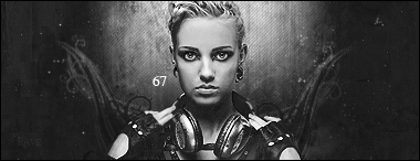
RAVE 67
- Thread starter Rave
- Start date
XGC TOMMYGUN XC
Community Leader
I like the color better!! It looks like the render may be just a little over sharpened i think!! And its a little to centered or something for me!! thats just my opinion.....good job!!
XGC TOMMYGUN XC
Community Leader
Lol. I hear that!!! Its so disappointing when some art looks really good in photo shop and you get it on the website and its blurry!!! No one else can get the full effect of what you just created..... Sucks!! Lol
SYN MsTwiztid
New member
Ok. I definitely think you should have used your Rule-of-thirds on this one. And i'm not really feeling the c4d that you used. In the BnW, it's not so bad, but in color, it really throws it off. Maybe if you do it in silver instead of green.


