You are using an out of date browser. It may not display this or other websites correctly.
You should upgrade or use an alternative browser.
You should upgrade or use an alternative browser.
RECENT SIG CNC PLEASE :D
- Thread starter Sgt DeathSquad
- Start date
Sgt DeathSquad
Banned
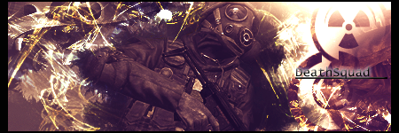
ya i thought so too. i need to fix that. what about my current signature im using what you think about that one?
NecroWhuut
New member
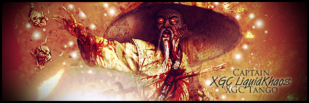
the problem with the light source is that its not colored properly, when making a light source try using a bright color that's similar to the one below it. the only situation where you should have a white light is when you have it UNDER a strong gradient map so that the color of the lighting doesn't make much of a difference. because the tag is so orange and red a really bright tone of orange would make the lighting fit a bit more, also put the layer on screen and lower the opacity 
as for your current signature the render is lq(not your fault im assuming) i think you have to work on lighting a bit more, at least your technique of creating lighting. the text is also a bit out of place not sure how to properly put text without it being distracting but nbd.
as for your current signature the render is lq(not your fault im assuming) i think you have to work on lighting a bit more, at least your technique of creating lighting. the text is also a bit out of place not sure how to properly put text without it being distracting but nbd.
XGC AfroSamurai
New member


Let me know what you think?
Sgt DeathSquad
Banned

this look a little better?

