- Forums
- XILED TEAMS
- DESIGN & EVENTS TEAMS
- DESIGN TEAM
- DESIGN TRAINING GROUNDS
- TRAINING GROUNDS HISTORY
You are using an out of date browser. It may not display this or other websites correctly.
You should upgrade or use an alternative browser.
You should upgrade or use an alternative browser.
SHREDDA'S WEEK #17
- Thread starter IXssl
- Start date
XGC SinCity
New member
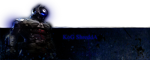
I think when you were blending the render in you made multiple copies and gausian blurred them. If thats the case try erasing all the blurred one's where your render pops out because the blurring around the top of the render is pretty distracting. Also there's a lot of negative space to the right.
TheRealMrNUGGET
New member
I'm gunna be mean at first, but bear with me, I do like it.
The outer glow effect doesn't look good once it's 'popped' out in my opinion, also it looks like the render was overplayed onto the bottom and not the top, so it looks weird, especially near the arms. Lastly the box isn't clean cut, but the unclean part doesn't have the same effect as the part below.
The box as a whole was a big thumbs up, and the render placement was alright. The color scheme was good too. Keep on trying.
its not an easy thing to do. But once you get the hang of it its amazing. There are ALOT of tutorials out there for "photoshop out of bounds efffect" as jupiter said, other than the top border being a little messy, its not a bad sig at all! Great job especially for first time! Render selection honestly is one of the biggest factors in OOB

