- Forums
- XILED TEAMS
- DESIGN & EVENTS TEAMS
- DESIGN TEAM
- DESIGN TRAINING GROUNDS
- TRAINING GROUNDS HISTORY
You are using an out of date browser. It may not display this or other websites correctly.
You should upgrade or use an alternative browser.
You should upgrade or use an alternative browser.
SINCITY WEEK 15
- Thread starter XGC SinCity
- Start date
VenerealMonkey
New member

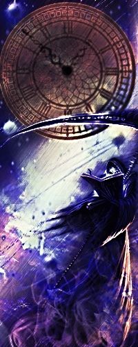
nice sig Sin! vast improvement from when you started your app.
-the scythe seems to be in front of the reaper, when in fact it should be behind and therefore blended to show that.
-not feeling the blue flame at the bottom. had you chosen a cloud render or some fog/smoke would be better.
-the cloud brush needs to go as well. again, try to find a cloud render to use instead
-to create some depth with the blue orbs, smart sharpen that layer, then use a 15% blur tool over each one individually varying the amount of blur to show that some are in front and behind the render.
XGC SinCity
New member
Thats really good bro
Thanks man, I appreciate it!
XGC SinCity
New member
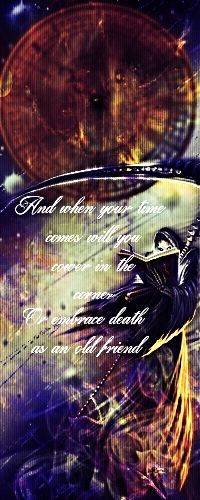
Better or worse?
nice sig Sin! vast improvement from when you started your app.
-the scythe seems to be in front of the reaper, when in fact it should be behind and therefore blended to show that.
-not feeling the blue flame at the bottom. had you chosen a cloud render or some fog/smoke would be better.
-the cloud brush needs to go as well. again, try to find a cloud render to use instead
-to create some depth with the blue orbs, smart sharpen that layer, then use a 15% blur tool over each one individually varying the amount of blur to show that some are in front and behind the render.

better, this is getting close to your skeleton sig as far as quality. keep it up.
XGC TOMMYGUN XC
Community Leader
Color scheme wise the purple one is better, keep paying close attention to blending your renders and stocks together as well as blending your colors together!!
XGC SinCity
New member
I'll do my best , there's so much stuff to 'keep in mind' it's hard keeping it all straight!! Lol
XGC TOMMYGUN XC
Community Leader
That big round clock is very distracting, I almost didnt notice the reaper in the lower corner!! lol it could be because its big, round and in the center or because its brown and the rest of your sig is purple and blue!! Maybe both, lol.
XGC SinCity
New member
This looks like an AMAZING bookmark(for a book, not a web browser, they do still exist
XGC SinCity
New member
Huh now that you mention it it does look like a bookmark lol


