- Forums
- XILED TEAMS
- DESIGN & EVENTS TEAMS
- DESIGN TEAM
- DESIGN TRAINING GROUNDS
- TRAINING GROUNDS HISTORY
You are using an out of date browser. It may not display this or other websites correctly.
You should upgrade or use an alternative browser.
You should upgrade or use an alternative browser.
SINCITY WEEK 16
- Thread starter XGC SinCity
- Start date
XGC Bradshaw90
New member
I like that, its pretty neat looking
SYN Vegeta
New member
that is nice
XGC SinCity
New member
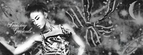
Lol thanks, found out I'm not a huge fan of black and white OR people
TheRealMrNUGGET
New member
I like the flow around her arm on the left. But on the right the black stuff just seems like... A weird ball of hair. I'm almost drawn to that rather than the figure.
Jupiter
New member
Your render is getting lost within the signature. She should be your focal but she really isnt popping out at me. I would definitely increase her size or decrease your canvas size. Aside from that, I dont see a whole lot of depth going on. Everything is the same strength as far as focus goes.
XGC TOMMYGUN XC
Community Leader
I would definitely increase the size of your render!! I think thats the problem a lot of people have, they try to get to much of the render into the sig that it ends uo being really small and giving an effect of emptiness!! I think just getting her upper body and not the waist and hips would have made you sig look more full.......if that makes any sense, lol!!


