- SOME OF MY OLD WORK (CNC)-

XGC Phantom XD

New member

charliessig-1.jpg

Thedigitalmafia.jpg

iBomB.png

BattleCitySOTWC-1.jpg
PHaNToIVIxSig.jpg
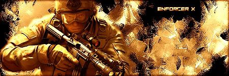
Enforcerx.jpg
Girl1-1.png
Supermanssig.jpg


Well I don't consider myself very talented cause I honestly suck at art and can't even draw stick figures but some people consider me decent, I believe myself to be garbo lol. Well don't be too harsh but let me know what I did bad AND good. This was with Photoshop CS1 and I used it for about 4 months. Thanks.
 

Sneakyy

New member
you are seriously better than most
keep trying and you will get really good

no one starts out perfect but your
off on the right foot bro

im not kidding, keep designing
 

Ryann

New member
Don't use borders, move your text near the focal but not on it, also make your sizes around 350-410ish too 100-200ish
 

Wicked 7

New member
I personally see nothing wrong with borders its all on personal preference there as long as it doesnt go overboard and you dont end up with more border than sig lol its all looking pretty good so far just keep it up
 

XGC Phantom XD

New member
I personally see nothing wrong with borders its all on personal preference there as long as it doesnt go overboard and you dont end up with more border than sig lol its all looking pretty good so far just keep it up
Thanks, the borders I got on these sigs up here, are they ok? I didn't really see them as too much.
 
Top