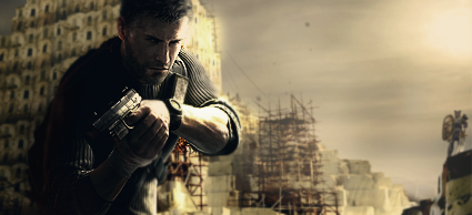
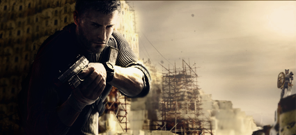
Not a bad tag overall, but it really needs some more work.
For one, the lighting is inconsistent across the tag. It shows much more intensity on the focal than it does on the structure behind him, and the light source itself is the Sun, which should not cause such intense shadows either way. Having said that, the left side of the tag is too dark in general, and looks a bit fake.
A second problem is your blurring. You have almost all of the focal sharpened - all except for a small piece of his lower left torso - which is distracting. In the background there should also be a little more diversity in the depth of blurring. It looks like you used one consistent blur level for everything in the background, though parts of it (specifically the stone area directly right of the scaffolding) are easily much further back and should be blurred at least slightly more.
The final problem with the tag is an aesthetic one - balance. You have so much going on in the left side of the tag (the focal, the complex structure behind him), but nearly nothing on the right, which makes the tag look terribly off balance. The right side looks much too empty and bland.
If you can address these problems (and the only one that I would think too tough to fix being the last one), then you have a very, very nice tag. Right now, though, it's just at the point of "getting there".
(I apologize if I'm being a little too critical for the 'new guy' around here, but I do drop these long critiques from time to time.)


