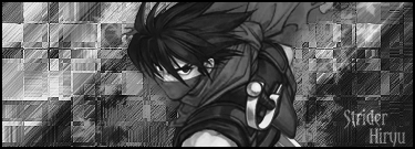
STRIDER HIRYU

XGC Paramore

New member

a406544d.png

V1

ec57eed1.png

V2

7dc40db0.png

V3

11fd4641.png

V4

97033b9d.png

V5

863c857b.png

V6

Speak your mind if you want to. I alrdy know what you guys are pretty much gonna say bout my work
 

TRu SANDMAN Cd

New member
this coming from you have you looked at your black and gray sig there as of late ticket come on now! i could say the same of yours

and bk they all look great man nice work
 

KiD DMND

New member
lol ^hes making fun of you lmao

buyt i agree with ticket but it is way to simplistic imo
depth is off
mono and lighting is iight but kiu
 

ChangeOfMandate

New member
Woah woah woah, calm down there, buddy. Don't insult his sig, he clearly likes it. You don't like it when people insult your work, so don't mess with his.
 

XGC Paramore

New member
Relax ya'll.
@Ticket I know it monotone. I'm not blind(obv if i was i wouldnt be able to do this) But all other opinions alot of people liked especially people that work as graphic designers for a living. and as well I liked it. and as I said in the begining of this post i alrdy knew what u guys were gonna say.
@SlimJim I know its simple didnt take much more than 10 layers but you know simple maybe sometimes better. after all im not as good as ya'll in graphic designs. I tought myself and I'm a slow achiever it takes me town to get a lvl of using C4D and such. and if you think this is plain you should of just looked at my work. Probably to you its a simple and basic and im pretty sure u can do them.
 

NecroWhuut

New member
Looks pretty good. Oy thing is lighting and really monotone.

this + v4 is the best since the renders color tone matches the bg the best in this. when you do render tags you should experiment with either using levels or clipping masked graident maps to match the tones and contrast with the colors in the bg. or match the bg to the render. but look out for that and try experimenting more with that, its one of the more important things to artists who use renders a lot as their whole pieces could be potentially ruined bc of it. but i think its nice so good job kiu
 

Brohaffey

New member
it is way to simplistic imo

Man, I've seen some of you guys just have a background, a render, a few C4D's, and a B&W gradient. You say this is simple?


... mhmm ....


I think it looks pretty good man. I like V4 the best because it balances the colors well. The other ones above it have a bit too much purple, you know what I'm saying?

The depth is off, but I don't care about that as much. In the end, the only thing that matters is if you liked the finished product and you think you got a little better from it.

If those things are true, then I see no reason to say that it's not good. :)
 

Wicked 7

New member
Man, I've seen some of you guys just have a background, a render, a few C4D's, and a B&W gradient. You say this is simple?


... mhmm ....


I think it looks pretty good man. I like V4 the best because it balances the colors well. The other ones above it have a bit too much purple, you know what I'm saying?

The depth is off, but I don't care about that as much. In the end, the only thing that matters is if you liked the finished product and you think you got a little better from it.

If those things are true, then I see no reason to say that it's not good. :)

Agreed but i kinda like v1 to but i like the purplish color schemes better its kinda my thing as of late they look good to me great work on all of them.
 
Top