SYN SINON APPLICATION

SYN Kiwi

New member
1) Gamertag and user name - Darkerkiwi
2) What type of program are you using? CS6 .. among other programs
3) How much experience do you have with your program and making signatures or banners? A lot. I have over 10 years of graphic and web design behind me. I do high res, top quality photos, nothing grainy.
4) What is your current clan & rank? Will this affect your ability to fill the requirements of being on the design team? Syn Insidious and Seargent, I am available on a limited basis for graphics (that said I could probably do about 10 items a week, more on my weeks off of work).

For graphic design, I have my own style and I love clear, high res images. I ensure that you will be happy with my graphics and I communicate throughout the process. ** I do take creative control of my graphics, give me what you want (or the top 3 things that you really need to have in your graphic) and let me have free range from there. ** - banners, sigs, any graphic that doesn't require coding-

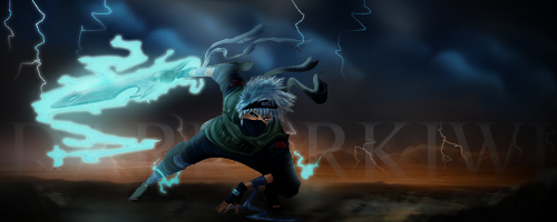
darkerkiwi_zpsiia9ybp4.jpg

Facebook-Cover-Photo_zps7tlkghfh.jpg

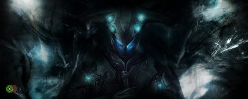
supafinn_zpsze7c0mb7.jpg


For website design I make websites based on a cms platform, re-skin, re-design, re-code for purpose. I also make sure that they are responsive (cross-platform/browser compatible). -if web design/coding services are required, they will cost real money-
 
Last edited:

SYN Jordan XD

Administrator
1) Gameruser name - Darkerkiwi
2) What type of program are you using? CS6 .. among other programs
3) How much experience do you have with your program and making signatures or banners? A lot. I have over 10 years of graphic and web design behind me. I do high res, top quality photos, nothing grainy.
4) What is your current clan & rank? Will this affect your ability to fill the requirements of being on the design team? Syn Insidious and Seargent, I am available on a limited basis for graphics (that said I could probably do about 10 items a week, more on my weeks off of work).

For graphic design, I have my own style and I love clear, high res images. I ensure that you will be happy with my graphics and I communicate throughout the process. ** I do take creative control of my graphics, give me what you want (or the top 3 things that you really need to have in your graphic) and let me have free range from there. ** - banners, sigs, any graphic that doesn't require coding-
darkerkiwi_zpsiia9ybp4.jpg

Facebook-Cover-Photo_zps7tlkghfh.jpg

supafinn_zpsze7c0mb7.jpg


For website design I make websites based on a cms platform, re-skin, re-design, re-code for purpose. I also make sure that they are responsive (cross-platform/browser compatible). -if web design/coding services are required, they will cost real money-

Alright, very nice work!

As far as the the first sig goes, it has great image quality, and a good contrast between highlight and shades. Makes it pop more. However, the render itself and her placement does not compliment any specific light source to the highlights on her face, shoulder, or adornments in her hair. As i said though, it does give a good contrasting effect. Makes the render look very appealing in my opinion.

The second sig doesnt seem to reveal alot of difference between highlight and shade. The couple highlights i see on render have no evidence of its source. Personally i would choose a small grunge brush and burn the shadows in the clouds and highlight the foremost parts of the clouds with dodge. It looks like u have used a blur effect of some fashion. I like that, I think that is fitting to the theme. I probably would have placed render closer to center a little more and brought down the text and reduced size of it just in order to utilize more realestate on the sig. Seems like the bottom left third feels a little empty.

The last Sig has great contrast agn. Great Image quality. The stock doesnt feel like it fits the flow of the render. Not sure if the ripples in stock were present as is or effect was added. But the ones above the render contradict the direction and flow of the ripples on lower right side of sig. No apparent light source, and on this sig it would really be helpful most as it is such a definate highlight. The left side, i would have darkened as the light appears more dominant on the upper right.
Excellent work and you certainly utilize High def images. Always better to start off with the best qualty you can. I look forward to seeing more of your work!
 

SYN Kiwi

New member
Hey Syn Jordan XS

First Pic - the light source would be eminating directly in front of her, from our view point, and the background (darker area) is space so no light exists :) Thanks for the feedback and compliments, I'll pay more attention to designating a light source in future designs

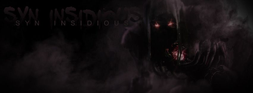
Second Pic - I agree, needs something to brighten it up for a focal point. I'll get back to the drawing board on that one and post it up here when I'm done. The lack of space is because i kept it as a fb cover photo, so it left space for an avatar and the name of the person. I've attached a revised copy let me know what you think :) , and yes thanks, I used the main stock image that a few people have seemed to use but I will change a lot about the stocks that I use, I really wanted to go for a foggy effect so I re-colored, adjusted image levels and did several Gaussian blur layers.. (about 6, with different levels of blur and layer styles) to get the effect :) Thanks for noticing. View attachment 35047

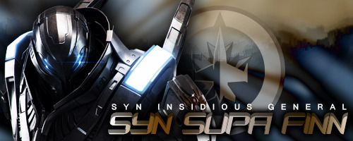
Third Pic - Yeah same issue with light source - are you looking for a light source to be prominent in the pic? I usually decide my source outside of the pic, especially if I have a lot of other detail to get in there.. You may want to check out the same pic but with a different background that I attached to the original post (the yellow and black one), I think it suits the stock more. The Ripple effect really helped out with getting the right color tone, which is why I used it :)
 

SYN Kiwi

New member
Ok Guys... I digitally painted this next one... from scratch.. except the stock that was provided in test images, lemme know what you think...

DK_zpsn08ocdiu.png
 

SYN Jordan XD

Administrator
Another One....

forget_zpsmmw7veci.png
This one is my favorite. I love the reduced stock, with the message utilized for the border. It has the texture that ive been wanting to see from your production. Did you use an adjustment layer on your text, or add an effect? Im curious to know how you created that effect.
 

SYN Jordan XD

Administrator
http://www.sigtutorials.com/tutorials/basics/ripple-and-smudge-signature.html. i would like for you to use this tutorial. And in addition, after creating your own stock from image, i would like for you to utilize fractals or other c4d of your choosing. And still maintain appropriate flow of focal. Please use this image

HTML:
[URL=http://s1238.photobucket.com/user/xgctommygunxd/media/Renders/0632ba85-97de-4283-a740-46dbdcd7f065_zpsd3d9253e.jpg.html][IMG]http://i1238.photobucket.com/albums/ff496/xgctommygunxd/Renders/0632ba85-97de-4283-a740-46dbdcd7f065_zpsd3d9253e.jpg[/IMG][/URL]
 
Last edited:

SYN Kiwi

New member
This one is my favorite. I love the reduced stock, with the message utilized for the border. It has the texture that ive been wanting to see from your production. Did you use an adjustment layer on your text, or add an effect? Im curious to know how you created that effect.

Hey, Thanks! I'm glad you like it...
I used layer masks for the text, but for that textured border I really wanted to go for a faded memory type of feel, so I blurred the photo with Gaussian (yes I know, same ol same ol) and then I grabbed a grunge photoshop texture and played around with different layer styles until it was just right :) , lots of brightness adjustments as well as a color adjustment and shadowing for the main stock. I'd be more than happy to walk you through step by step to re-create it.
 

SYN Jordan XD

Administrator
Hey, Thanks! I'm glad you like it...
I used layer masks for the text, but for that textured border I really wanted to go for a faded memory type of feel, so I blurred the photo with Gaussian (yes I know, same ol same ol) and then I grabbed a grunge photoshop texture and played around with different layer styles until it was just right :) , lots of brightness adjustments as well as a color adjustment and shadowing for the main stock. I'd be more than happy to walk you through step by step to re-create it.

Grunge brushing and adjustmeng layers are usually my primary goto style. Ive done alot of them with gaussian blur and erasing prominent areas in focal. As far as layer masking, and vector masks-i could definately use some help with understanding creative possibilities and options. Could use a hand in the border reduction for the popout render effect. Still not sure if i fully grasp that concept yet
 

SYN Kiwi

New member
http://www.sigtutorials.com/tutorials/basics/ripple-and-smudge-signature.html. i would like for you to use this tutorial. And in addition, after creating your own stock from image, i would like for you to utilize fractals or other c4d of your choosing. And still maintain appropriate flow of focal. Please use this image

HTML:
[URL=http://s1238.photobucket.com/user/xgctommygunxd/media/Renders/0632ba85-97de-4283-a740-46dbdcd7f065_zpsd3d9253e.jpg.html][IMG]http://i1238.photobucket.com/albums/ff496/xgctommygunxd/Renders/0632ba85-97de-4283-a740-46dbdcd7f065_zpsd3d9253e.jpg[/IMG][/URL]

Haaaaa.. so not my style but here we go... Critique away.. BTW - Spidey didn't show up until I already made this.. I'll make another :'( Lol

somedude_zpsrvcqazi0.png
 

SYN Jordan XD

Administrator
Haaaaa.. so not my style but here we go... Critique away.. BTW - Spidey didn't show up until I already made this.. I'll make another :'( Lol

somedude_zpsrvcqazi0.png
Cool deal. Im interested to see what the original image you used for this one. Btw.. Is that an 8bit kiwi fruit in the lower left corner? Lol
 

KoG KiLo69

New member
You are definitely well versed in your program. I believe we will be able to learn from you as well as you from us. That being said, in your work I would try to add more depth to them, some look a bit flat, I can see the light sources and shadows but it just seems to lack depth to me. Also on a couple of your darker sigs it could use some contrast and a small bump on brightness. To help them pop a bit. Overall, great work and I'm interested in watching your work as you progress. Keep it up Kiwi!!.
 

SYN Kiwi

New member
You are definitely well versed in your program. I believe we will be able to learn from you as well as you from us. That being said, in your work I would try to add more depth to them, some look a bit flat, I can see the light sources and shadows but it just seems to lack depth to me. Also on a couple of your darker sigs it could use some contrast and a small bump on brightness. To help them pop a bit. Overall, great work and I'm interested in watching your work as you progress. Keep it up Kiwi!!.

Thanks very much, yes the lighting is something I'm working on, its been years since I've done sigs, but its fun getting back into it and adding tools to my toolbox of tricks. I'm happy to post tutorials and help out whenever needed. :) you guys have awesome CnC - very constructive
 

SYN Jordan XD

Administrator
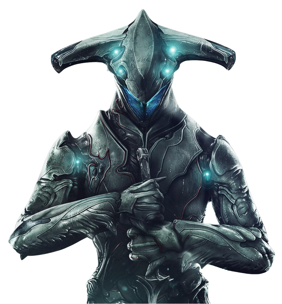
Original
warframe_loki_zpsgdqir7if.png


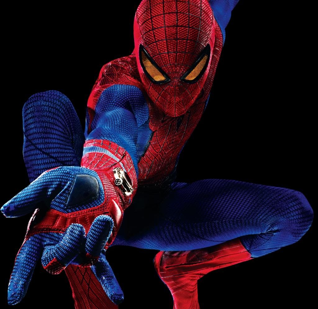
and Spidey as requested

spidey_zpsiutghv5e.jpg


8-bit Kiwi? Where :p
Here goes.. alright, one common thing designers do is find a way to efficiently streamline specific shade and highlight effects that adjust the whole layer and they do that accordingly. Or they use large brushes and select areas to create depth. Attention to detail is always a standard that each specific designer determines themselves.. that being said-its one thing that is easy to stray from when mass producing sigs(effectively what we have all been pitfall to on occasion) But then there are those defining creations that we make and they give us our greatest sense of accomplishment. Going outside of our comfort zone, breaking new ground altogether, etc. This experience right here, is one where we all learn and benefit. This is our progression. Together.

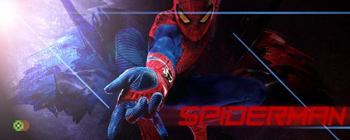
Awesome work. As ive said, i look forward to seeing your productions. I love the Spiderman. I wouldnt touch that one. Not a bit.
If it lacks any depth, i would magnify and take a 8 pixel sharpen brush and have it until u have desired effect. Subtlety goes a long way though. I like to think that you would agree. I see enough evidence of smooth effect in your style.
 

SYN Kiwi

New member
Thanks for the feedback! :) Im really about smooth effects that belong in the photo, sometimes they need to pop and really grab your eye and sometimes just a little bit of light is the answer depending on what you're going for, that's what makes everyone's styles unique :), I won't be touching the Spidey sig, for my personal style it has enough depth and contrast, but I do see where I could push for just a little more with some of my other pics. I'll take it into consideration, was there anything else you guys needed to see from me?
 

XGC Browncoat

New member
I would like to see how you do with requests, because most of what we do are requests. So go ahead and pick up one of the requests in either the signature requests area or in the banner requests area.
 
Top