You are using an out of date browser. It may not display this or other websites correctly.
You should upgrade or use an alternative browser.
You should upgrade or use an alternative browser.
TELL ME WHAT YOU THINK? AND ALSO, NEED HELP ON SOMETHING..
- Thread starter SnugIeZ
- Start date
my pic isnt showing up.. i'll just post the link.
http://s623.photobucket.com/albums/tt320/gankked/?action=view¤t=Btrumpsbrah.jpg
http://s623.photobucket.com/albums/tt320/gankked/?action=view¤t=Btrumpsbrah.jpg
OffsideRunaway
New member
um u might have sent it to a differ format like html or http i dont kow what type this
_Depression
New member
Well, you did a decent job, but there were parts that you really should have worked on more.
For one, your renderings were pretty poor, and the only excuse for that is a lack of practice or patience. Using the path tool, all you need is about an hour and a good eye, and it's really not that tough. But hey, you've only been doing this one year, give it some time and you'll improve.
The second problem is the the sharpness; the transitions from colored to monochrome are all really pixelated lines, which looks absolutely horrid. On top of that, the second character from the left is extremely blurry, which is the fault of either a bad picture you cut from, or a bad resizing job. Either way, you need to sharpen that.
Now, while those first two are maybe understandable, innocent mistakes, this next one isn't. On the bottom right of the post, just below the text, it's obvious that you tried to cut away the colored bar with a circle eraser tool. Honestly, that's inexcusable and extremely lazy, not to mention you did a really bad job. Next time, try using the Path tool to cut it away.
On top of that, your "In Theaters March 2008" text looks shoddy, and not evenly planed; your text is also not italic, like it is in the real poster, but the texturing is good.
Overall, a decent try, but you need some work on execution.
Thanks for the criticism. Now, to explain a few things.
This was done in one period of class, which is a 83 minute period. For a rush job, finding the pictures on google and such, this, in my opinion was really damn good.
Second, the guys body on the bottom right was made using the stamp brush. The picture i cut him out of didn't have the lower portion of his body, so i had to recreate it. But you are right, a very poor job.
And lastly, if you can give me a few links to some good tutorials so i can get back into the design team, that would be great.
Thanks again.
_Depression
New member
Well, your best bet is to start off with DeviantArt. I'll post a few of my favorites for you, and then link you to the place where you can just browse through them:
http://senthrax.deviantart.com/art/...55042010?q=favby:Inyro-Gatling/10805578&qo=14
http://thegfxguy.deviantart.com/art...133670090?q=favby:Inyro-Gatling/10805578&qo=7
http://daconman.deviantart.com/art/WANTED-Tut-93434062
http://zenron.deviantart.com/art/Ze...164141102?q=favby:Inyro-Gatling/10805578&qo=0
And then, you can browse through all of the PS tutorials here:
http://browse.deviantart.com/resources/tutorials/appreference/photoshop/
Edit: And to respond to your points:
If you knew about this assignment before the 83 minute period, I would have spent the night before finding the stocks I wanted to use, and saved the URLs to them on a .doc, then emailed that to myself and opened it in class, which would have cut down on time.
As for the stamp tool, you still could have created a selection box with the path tool, and them filled the box with the stamps. That way you still don't have the bad look.
_Depression
New member
Which ones? The white ones that are bordering the orange sections?
yeah. actually, now that i think about it i could of used the pen tool and filled the stroke with white. im still a little rusty. maybe you could post some pictures for me and i can do them, then you can CnC for me? it'll give me some practice before they give me photos for my apps.
_Depression
New member
I don't know what you mean by "do them", but I always found it helpful to just experiment with making things that I wanted to make, not something that I was told to make.
However, if you do want a faux assignment, try this one:
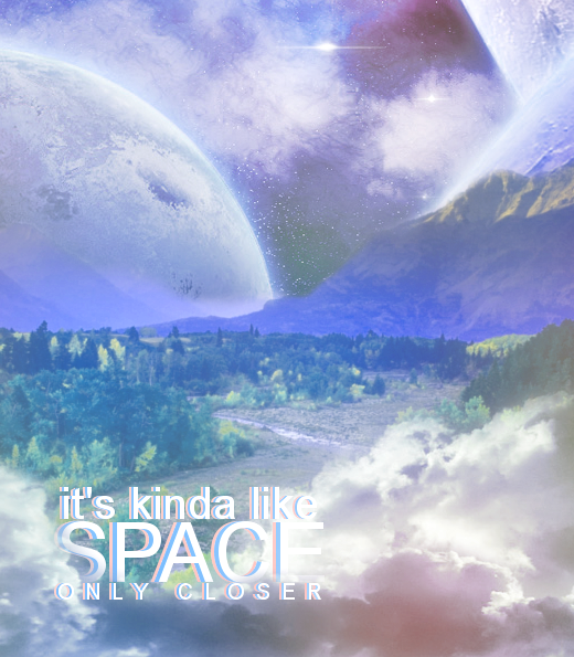
Take a picture of a landscape, a spacescape, and some clouds, and combine them into something like this:

(As a guideline, I used 5 different pics for this one. 2 different cloud pictures, 1 spacescape, the mountains, and the forest area)
However, if you do want a faux assignment, try this one:
Take a picture of a landscape, a spacescape, and some clouds, and combine them into something like this:

(As a guideline, I used 5 different pics for this one. 2 different cloud pictures, 1 spacescape, the mountains, and the forest area)
_Depression
New member
Lol then let's start simple.
Combine this pic:
http://i150.photobucket.com/albums/s116/KissMeLyts123/landscape.jpg
With this one:
http://fc02.deviantart.net/fs32/f/2008/221/f/a/Bronze_the_Chaos_by_mightystag.jpg
Edit:
Also, here's the fullsize version of that photomanip I made, if you're interested lol:
http://inyro-gatling.deviantart.com/gallery/#/d2enow6
pretty much all has been stated with regards to what I wanted to say. So I will point you in the direction of some tuts.. ok THIS site is where the pros post their tuts, and it has a bunch of different tuts from other sites
www.tutfactory.com
www.tutfactory.com
_Depression
New member
Lol well he's looking for tuts to get back into designing, not to become pro overnight.
DA is a great place to start, then you can work your way up.
And what do you mean by removing stuff with the pen tool?
DA is a great place to start, then you can work your way up.
And what do you mean by removing stuff with the pen tool?
Lol wellhe's looking for tuts to get back into designing, not to become pro overnight.
DA is a great place to start, then you can work your way up.
And what do you mean by removing stuff with the pen tool?
never said he had to become pro overnight, just saying this is where professional artist post EASY to HARD tuts that are extremely easy and step by step to follow, and no deviant art is a community dedicated to artists posting their work, not a place for tuts my friend... wrong site. This site is dedicated to quality tuts from around the web.
He means like making a path with the pen tool then putting a stroke on the path and cutting out the inside of the stroked path over the picture. Pen tool is also great for making vectors. You could try doing a couple vector cut outs and see where you get.

