- Forums
- XILED TEAMS
- DESIGN & EVENTS TEAMS
- DESIGN TEAM
- DESIGN TRAINING GROUNDS
- TRAINING GROUNDS HISTORY
You are using an out of date browser. It may not display this or other websites correctly.
You should upgrade or use an alternative browser.
You should upgrade or use an alternative browser.
TGUNDESIGNZ WEEK #69
- Thread starter XGC TOMMYGUN XC
- Start date
SYN Ichigo
New member
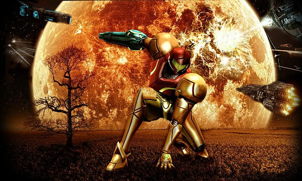
Amazing work tommy on the first one the pink light under her arm wants to draw my attention away from the focal, but other than that great. On the second one the tree in the background is throwing it off for me with the amount of depth it makes her look like she's bigger than the tree, but I like the way its going. Great work as always! 
XDC Dresden
New member
I like that you made your watermark less visible! The wallpaper looks great!
CAPOS SNOW
New member
The light source placement on the sig doesn't work. It is in the wrong location. The text has a faint outline that I personally don't care for. The tex is also angled incorrectly. It doesn't look parallel with the shoulder or the direction the body is moving. It also looks like the text is put on an image and not actually apart of it with the c4d's flowing thru it as opposed to flowing behind it. The top right of the sig doesn't seem to flow with the bottom left. You did work the render in well and the color scheme works perfect for the sig.
The bottom one looks good but the render does not blend into the background. The background is a little pixilated and the render not so much.
still good work, but I think that you have had better ones.
The bottom one looks good but the render does not blend into the background. The background is a little pixilated and the render not so much.
still good work, but I think that you have had better ones.


