THE NEW ****

xxThanatosx89

New member
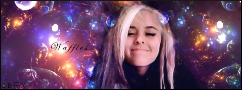
jadess.png

waflesles.jpg

Poorly rendered and blended FB admin

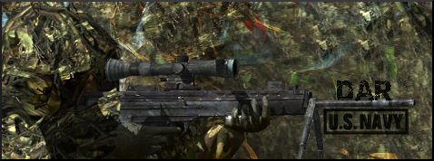
darrr.jpg

Navy seals I made for mi padre
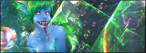
tttttttttttt.png
 

SYN MsTwiztid

New member
on the first two youve got the floaty head thing going on, and you forgot your rule of thirds~ other than that, theyre great.

the camo one is good, the only thing i would change is the vibrance. there are two spots where red and green pop out and are really bright, maybe dull that back a bit.


i love love love the troll. ^.^
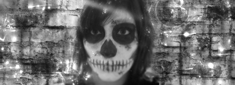
 

XGC TOMMYGUN XC

Community Leader
I think you have a good knowledge of using effects!!! I would suggest you really start working on lighting for example the troll sig, it looks good, but there are small hints on the troll that light is coming from the top left side of the troll and the only thing you have with a little light from it is the bubble effect, if you could have just put a light source in that top left and bring out some of the lighting and shadows in the troll, it could look really good!!......It could change the whole look of your art and really make it looking good!!! Just my opinion!!
 

xxThanatosx89

New member
Thank you tommy I've lost a lot of my knowledge being remotely inactive lately but I will try and work with that on my next designs
 
Top