SYN Kiwi
New member
One of the simplest things you can do to improve your graphics is to proof the stocks that you are using. A good rule of thumb is that if an image doesn't look good in black & white it WILL NOT look good in colour. This is also the same "screening" process I use to turn away customer supplied images and also how I decide whether an image will be in black and white or colour.
Why is this an important step? Images that translate well to black and white, with clear features are EASIER to MANIPULATE and APPLY EFFECTS. Eventually you'll develop an eye for what will work and what won't work. It's easier to see what is lacking from the image and whether you have to amp up the light, mid or dark tones to enhance the overall image.
To desaturate an image hit Ctrl+Shift+U in Photoshop CS6

This particular stock of wolverine needs a lot of work. It's grainy, there is loss of detail and overall just not the best choice for stock that's out there. The only way to save this image is to do a Gaussian Blur overlay with an adjustment layer (levels) to try to amplify the quality.

This stock is much better quality. It's smooth and doesn't lose any detail. It has Light, Medium and Dark tones that define it well. Because the details still pop when this image is in black and white, photo manipulation effects will take to it much easier than the previous wolverine stock. It could use a little enhancement with the light tones, but other than that it looks good.

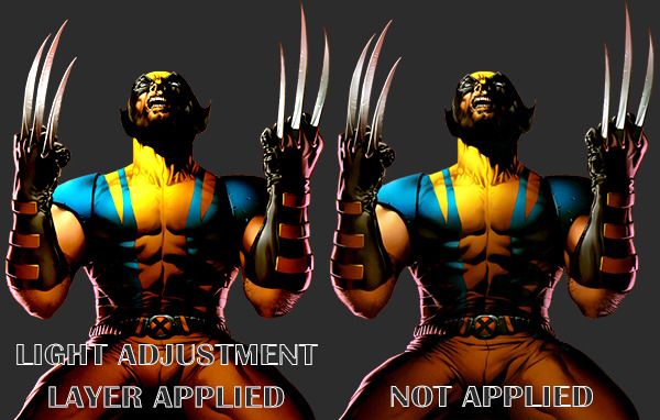
Because I could see that the light tones in the black and white image didn't pop, I was able to adjust my color layer and increase the light tones just a little more to amplify the stock image and give it depth. Here is the before and after image of the stock in colour.
Questions? Let me know
Why is this an important step? Images that translate well to black and white, with clear features are EASIER to MANIPULATE and APPLY EFFECTS. Eventually you'll develop an eye for what will work and what won't work. It's easier to see what is lacking from the image and whether you have to amp up the light, mid or dark tones to enhance the overall image.
To desaturate an image hit Ctrl+Shift+U in Photoshop CS6

This particular stock of wolverine needs a lot of work. It's grainy, there is loss of detail and overall just not the best choice for stock that's out there. The only way to save this image is to do a Gaussian Blur overlay with an adjustment layer (levels) to try to amplify the quality.

This stock is much better quality. It's smooth and doesn't lose any detail. It has Light, Medium and Dark tones that define it well. Because the details still pop when this image is in black and white, photo manipulation effects will take to it much easier than the previous wolverine stock. It could use a little enhancement with the light tones, but other than that it looks good.

Because I could see that the light tones in the black and white image didn't pop, I was able to adjust my color layer and increase the light tones just a little more to amplify the stock image and give it depth. Here is the before and after image of the stock in colour.
Questions? Let me know
Last edited:
