URBAN AND THE TICKATO COLLAB

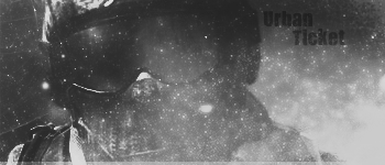
Urbantickatocollabcolo.png


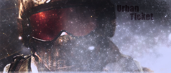
Urbantickatocollab.png

CnC
 

Swift

New member
The Focal kind of blends in with the background, and there are way too many sparkle effects in front, i would definitely try to limit or eliminate those, and establish a more shrunk version of the focal. Get some lines and light in this tag, you can do that by putting a gradient map over the tag. Definitely fix the colors too. Try a version two. Fix the text too btw its very generic
 

Wicked 7

New member
Back to CnC now lol. I like the color version better. The lighting could use a bit of work tho. Its reflecting off of the goggles at the top as well as coming in from the bottom. Other than that its looking pretty good guys keep up the great work.
 

Swift

New member
Im not throwing insults... i am saying how it is. I am not saying words such as ****ty or Ugly as **** or FUGLY or that is just a piece of ****. I am telling what I see. nothing else. You guys are the ones throwing out insults left and right :/
 

ChangeOfMandate

New member
Just be a little nicer, man. I take **** personally, sometimes, and I'm sure you know how that feels right now.

:D At least say the snow effect I did was done well?
 

Fillyy

Banned
Totally agreed KillnTym. Most of the time, the only reason people get insulted is because they have insulted before. What goes around, comes around. Just remember that guys and girls!

On to the tag, It is very well done, only thing I dont like is the text, but that is easily fixed. Good job and Keep it up.
 
Top