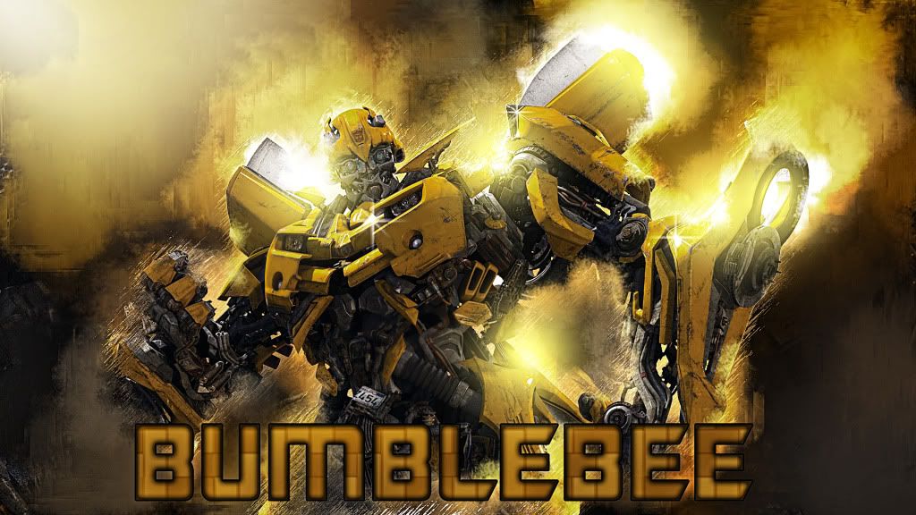
Nice job, only have a couple of suggestions. One the top left corner looks very out of place needs to flow with the other corners. The other is a the text. It's nice but very plain, it needs some texture , depth or even distressing the letters might do the trick. Just a few suggestions bro keep up the great work. Remember being a artist means constantly challenging yourself in all medians. Stay Frosty my Friend. ;-)


