- Forums
- XILED TEAMS
- DESIGN & EVENTS TEAMS
- DESIGN TEAM
- DESIGN TRAINING GROUNDS
- TRAINING GROUNDS HISTORY
You are using an out of date browser. It may not display this or other websites correctly.
You should upgrade or use an alternative browser.
You should upgrade or use an alternative browser.
WEEK 46- DRESDEN
- Thread starter XDC Dresden
- Start date
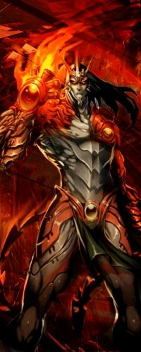
Not to shabby, the flow is a little off, i would have made a flow from the bottom left to upper right. The flaming hand is mostly the focal point so you want use the focal's flow for the rest. The c4d at the bottom throws the whole sig off the flow i see is from top left to bottom right then the c4d at the bottom goes left to right, not to mention its more of a greener color. I also see hints of purple and pink at the top as well, that also is a bit distracting, keep in mind when doing sigs dont use colors other then the colors on the render.
Some suggestions for ya, im not sure if you use gimp or photoshop, but try the eye dropper tool to pick colors out, Also try using gradiant maps to help with color control, and any other sort of color balance tools you can find. Another thing too if you like the blending you like the design and flow but you do NOT like the color dont hesitate to make it black and white and just put a dash of color in it like my pikachu sig i have as you can see its black and white you should see how it looks with color, it looks horrible, and i already spent alot of time on it so when in doubt black and white it lol, just remember not to make every sig black and white.
Thank you for doing the Training Grounds, Keep bringing it strong.
XDC Dresden
New member
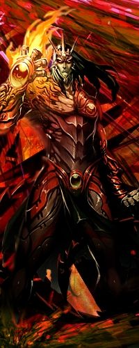
Here's my revised version.


