- Forums
- XILED TEAMS
- DESIGN & EVENTS TEAMS
- DESIGN TEAM
- DESIGN TRAINING GROUNDS
- TRAINING GROUNDS HISTORY
You are using an out of date browser. It may not display this or other websites correctly.
You should upgrade or use an alternative browser.
You should upgrade or use an alternative browser.
WEEK 58
- Thread starter XGC POKER
- Start date
SYN Ichigo
New member
There are definitely some things that I can help you out with since I know your using photoshop like me. Sry I haven't been on the xbox or internet very much this week due to the snow/ice storm that came through. Hopefully I will be able to be on a little more once the ice and snow is gone.
SYN Ichigo
New member
Its good. Just needs a few tweaks to get it amazing. =)
SYN MsTwiztid
New member
The very first thing that throws me off is the text. It's big, clunky and takes too much attention away from the focal. Try straightening it up, hugging it closer to the focal, making it a smaller size, lowering the opacity and maybe even picking a different font all together. Just no bueno.
Another thing you need to remember is Rule-Of-Thirds. The rule suggests that an image should be imagined as if it were divided into nine equal parts by two equally-spaced horizontal lines and two equally-spaced vertical lines, and that important compositional elements should be placed along these lines or their intersections.
This is how it would be divided up in your signature.

As it stands, none of the important elements of your piece are on these guidelines.
Here is how i would place my focal.
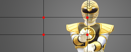
I personally don't like it to be dead center with the line, so i moved him over to the right a little, but it's really up to you how you want to proceed with this one.
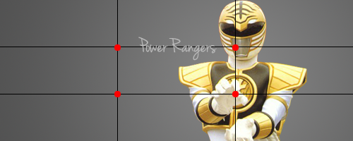
As far as the text goes, less is often more. You don't need big, flashy, you need more subtle. And you also want to use your text kind of as a bridge to the focal.
If you think about it, our eyes are used to going left to right naturally when reading or viewing an image. Use this to your advantage.
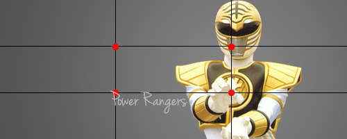
Here is how i would lay out my text. Keep in mind that once all of the effects are added and in play, you might have to re-position your text to make it all come together. But this general guideline should help.
The next thing that you need to work on is blending. For the sake of helping you out, i threw a background together rather quickly. It's just a couple of different brushes, colored with an effect or two. That part isn't really that important, but when picking your background you want to keep your color scheme in mind. Of course, for this one, the obvious choice is yellow. (You want to pick your colors from you render.)
What i did to blend him in was I took my blur tool (I use photoshop cs4 atm, not sure what you're using, but there should be some kind of blur option), i set the strength down to 50% and I blurred around the outside of my render. I also went back and blurred part of my background to make it look better. You want to be cautious, however, or blurring too much of your focal.
This is my sig before blending:
 After blending:

Then, if you'd like to spice it up a bit more, you can add a c4d or space stock. Something along those lines. I'm not going to go too indepth with that part, but i wanted to touch on these 3 things with you. =)
I hope all goes well on your journey to learn design.

Another thing you need to remember is Rule-Of-Thirds. The rule suggests that an image should be imagined as if it were divided into nine equal parts by two equally-spaced horizontal lines and two equally-spaced vertical lines, and that important compositional elements should be placed along these lines or their intersections.
This is how it would be divided up in your signature.

As it stands, none of the important elements of your piece are on these guidelines.
Here is how i would place my focal.

I personally don't like it to be dead center with the line, so i moved him over to the right a little, but it's really up to you how you want to proceed with this one.
As far as the text goes, less is often more. You don't need big, flashy, you need more subtle. And you also want to use your text kind of as a bridge to the focal.
If you think about it, our eyes are used to going left to right naturally when reading or viewing an image. Use this to your advantage.
Here is how i would lay out my text. Keep in mind that once all of the effects are added and in play, you might have to re-position your text to make it all come together. But this general guideline should help.


The next thing that you need to work on is blending. For the sake of helping you out, i threw a background together rather quickly. It's just a couple of different brushes, colored with an effect or two. That part isn't really that important, but when picking your background you want to keep your color scheme in mind. Of course, for this one, the obvious choice is yellow. (You want to pick your colors from you render.)
What i did to blend him in was I took my blur tool (I use photoshop cs4 atm, not sure what you're using, but there should be some kind of blur option), i set the strength down to 50% and I blurred around the outside of my render. I also went back and blurred part of my background to make it look better. You want to be cautious, however, or blurring too much of your focal.
This is my sig before blending:


Then, if you'd like to spice it up a bit more, you can add a c4d or space stock. Something along those lines. I'm not going to go too indepth with that part, but i wanted to touch on these 3 things with you. =)
I hope all goes well on your journey to learn design.

XGC Radioactive
New member
and now I understand the rules of third....<.<
SYN MsTwiztid
New member
and now I understand the rules of third....<.<
Glad i could be of assistance! xP
XGC Radioactive
New member
Glad i could be of assistance! xP
i think i've kinda been following it by instinct...?

