XGC MUGGLE APPLICATION

XGC Muggle

New member
1) GT and user name: XGC Muggle

2) What type of program are you using?
Photoshop CS6

3) How much experience you have with your program and making sigs
Photoshop many years but making sigs 4 months

4) Would you be interested in transferring to XDC to be in a clan with other, like-minded members who also enjoy designing?
Nope, I would like to freelance.

Here are some examples I have made:
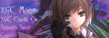
Girl3_zps9ede0e42.jpg


ChargerFan2_zps34338726.jpg


KoGWarXD_take2_zps20665190.gif


TheFallenBanner4_zps06bbe6a7.png


E_zpsa5c8133d.jpg


k_zps39a5de9c.jpg


VinnieCrack2_zpsda99af2b.jpg


Banner1_zps128823e3.jpg


from the test images:
CuteGirl_zps1f8df93b.jpg


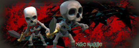
Skeletons_zps46b98b25.jpg
 
Last edited:

XGC Bradshaw90

New member
No freaking way!!! Lol glad you are here :) do some of the test images, your sigs you have done look pretty good...seems like you already have a good foundation...look foward to seeing some more work
 

XGC Bradshaw90

New member
The last two looks a little bit blochy copy and paste......the first two look good, need to lighten them up a little more but I think they look good. Constantly keep posting test images :)

See what Inked Ivy wrote:
.:KEEP UP THE ACTIVITY:.
The minimum is the test images. Do these and you can scrape by. The more "pumpin" your thread the better - everyone likes a good party. We only want to accept people who we know will fill their work quota - I know we get a lovely flashing usergroup banner but you need to continue earning the privelege to wear it
 
Last edited:

TheRealMrNUGGET

New member
More test images:
test2_zps1a4d8de1.jpg


test32_zpsd1da91ee.jpg


test4_zps7ade2bdf.jpg


test2_zps106d6fdc.jpg

I'm just going to number each image and talk about each.

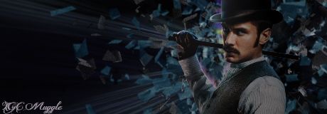
1) Strong point- good use of flow and rule of thirds. Things to fix- the lighting. The sig is too dark, and you have to light source.

2) strong points- great use of brushes in the background. Things to fix- the white clouds. They add too much white to the image. Try to change the opacity on them

3) strong points- this sig is pretty good overall in my opinion. Things to fix- this is a bit more personal but I feel that the flag in the background is blurred too much. It gives the sig too much depth.

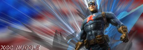
4) strong points. I like the idea, but the execution could have been better. Things to fix- use the rule of thirds. There is a rain effect visible on the helmet. Hide it or use it in my opinion. The flow is all over, so that could be touched up.
 

XGC Browncoat

New member
With those first three, there is quite a bit of empty space. I would suggest either moving your render to the left a little bit, or using a different size canvas.
 

SYN Gojira

New member
With those first three, there is quite a bit of empty space. I would suggest either moving your render to the left a little bit, or using a different size canvas.

Bouncing off of this, and this may just be based off my video team opinion (I am not welcome here *hiss*), but I feel the text could blend a bit smoother. The text seems rather, intrusive, if I can put it correctly. But a very nice use of finding nice cg models to match the overall theme of the renders.
 

VenerealMonkey

New member
Bouncing off of this, and this may just be based off my video team opinion (I am not welcome here *hiss*), but I feel the text could blend a bit smoother. The text seems rather, intrusive, if I can put it correctly. But a very nice use of finding nice cg models to match the overall theme of the renders.

Titan, I appreciate your input on this, but only Design Team members may post in application threads. You are always welcome in design, video or not lol, this forum is just for a select few
 

TheRealMrNUGGET

New member
What about these? Any suggestions/tips?

from the test images:
CuteGirl_zps1f8df93b.jpg


Skeletons_zps46b98b25.jpg

the first could Incorporate the rule of thirds a little more, otherwise i love it.
the second im actually impressed with you for using because i didnt think anyone would. i felt it was used very well, but the render could have been blended in a little more im i was being picky
 

TheRealMrNUGGET

New member
How about this one:

Girl3_zpsde845358.jpg


I also did this...

SmilingGirl2_zps9e7b45c5.jpg

a little much blur on the render of the first one.
the second could use a little depth. if you apply the image, and apply a guassius blur, then place a duplicate of the render on the top it will help the depth.

also youll notice that the render has part of the hair cut off. you always want to hide, or fix that when possible.
 

XGC BIZARRE

New member
Not trying to be a butthole, but I see a lot of your sigs where it looks like you just put the render on top of everything and do nothing to it...try blending. When I get home, I'll try to find you a good tutorial...also all sigs do not have to be 500x200. I personally like 400x200. There is a lot of empty space in your orange girl Sig....I would maybe eliminate everything to the left of her and zoom in on her...
 
Top