- Forums
- XILED TEAMS
- DESIGN & EVENTS TEAMS
- DESIGN TEAM
- DESIGN TRAINING GROUNDS
- TRAINING GROUNDS HISTORY
You are using an out of date browser. It may not display this or other websites correctly.
You should upgrade or use an alternative browser.
You should upgrade or use an alternative browser.
XZRISKYVZ WEEK#30
- Thread starter xzRISKYvz
- Start date
Jupiter
New member
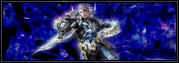
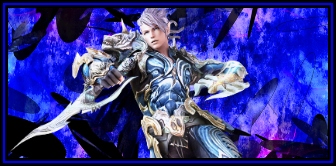
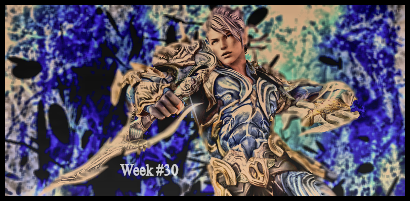
Well i dont think i would have gone that much smaller but see what i mean about getting rid of a ton of that negative space? the only other thing i would suggest is for the background using a lighter blue, the one from his clothing would look good. you should usually try to use colors from your render when building the background. another thing i would suggest is adding in a light source.
Rave
New member
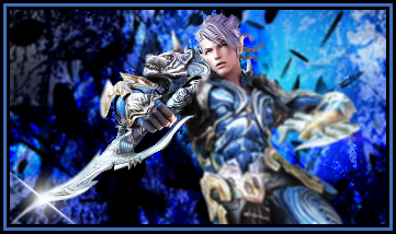
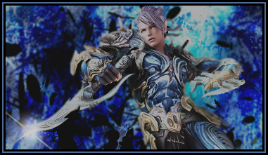
another try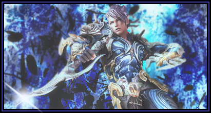
You seem to have added an effect that added a sort of "film" on the signature. You may want to remove that layer and add a stronger light source. Also, try removing or lessening the opacity of the lens flare on his dagger. The lens flare is sort of distracting.

