[ACCEPTED!!!] XGC GUNNUT APPLICATION

XGC GunNut

New member
Untitled-3_zpsaa614f3d.jpg


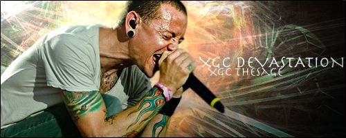
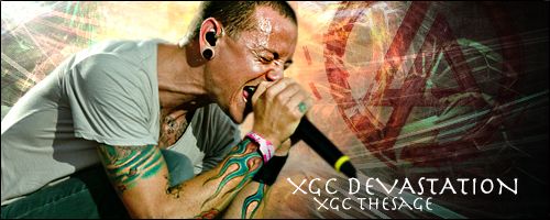
I tried to step out of my comfort zone on this one and apply what you guys said into this sig. Def took a bit of thinking outside the box, but again please let me know!!!;)
 

VenerealMonkey

New member
Looks good. Very minor stuff though, bring your text a little closer to your focal. Second, play around with sharpen and blur to give your focal depth. If you sharpen the sword at around 30-40% and then blur the bottom flap of the dress. If you select your blur and change the % to around 12, it allows you to blur what u want a little a time, but still be very noticeable. This technique also works with backgrounds.
 

XGC GunNut

New member
Untitled-3_zpsd95493f1.jpg


Here is the updated one. I moves text closer to focal and down slightly. Also i used the sharpen tool on the sword around 30% and used blur around 25% on parts or her body and slightly higher on her arm in the back. Please let me know if this looks better.
 

XGC GunNut

New member
TESTIMAGE3_zpsb7ce7291.jpg


Here is one of the test images!!! Hope it turned out ok, if not imma need to go back to the drawing board for pictures with the focal on them.
 

XGC GunNut

New member
darn ok i learned about that in photography, and i usually use it, but i guess i forgot, i will play around with it. Thanks for the feedback!!!
 

SYN MsTwiztid

New member
Ok, i want you to look at this tutorial. It's nothing spectacular, so i don't expect you to follow it, (Unless you just want to) but take note of the text. It's very subtle and it doesn't draw too much attention away from the focal. This is what i'm looking for with your text.

http://www.xiledgaming.com/showthread.php?157925-Funny-Kind-of-Love-Photoshop

With your last signature, it's kind of hard to do that because of the harsh color borders in your background. Find a way to soften that up a little bit and you should be able to do something subtle with your text and still make it look good.

Also, try to keep the colors in your background down to one or two. It looks like a rainbow attacked your canvas! lol.

Keep up the good work. You're definitely going in the right direction, now we just need to fine-tune it.
 

XGC GunNut

New member
ok perfect thanks so much, now i know where i need to focus, i was kinda struggling a bit. I will look at this and try to get some more stuff up tomorrow.
 

XGC GunNut

New member
Sorry, i found a lot of tutorials like the one ixias had, so i will be reviewing them and trying out some new things!!!
 
Top