- Forums
- XILED TEAMS
- DESIGN & EVENTS TEAMS
- DESIGN TEAM
- STORE EX-DESIGNER MEMBER THREADS (ADMIN ONLY HIDD
You are using an out of date browser. It may not display this or other websites correctly.
You should upgrade or use an alternative browser.
You should upgrade or use an alternative browser.
[ACCEPTED!!!] XGC ICHIGO APPLICATION
- Thread starter SYN Ichigo
- Start date
XGC Browncoat
New member
Hey bud, you got good colors on the pink and orange one but you should blend the edges of the renders in a bit better. This last one the colors are off and the render is really dark. When you get time you should do this tutorial.
http://fc08.deviantart.net/fs31/f/2008/206/c/a/Tuts_are_Dumb___Donkey_Kong_by_GCSkye.jpg
Also let me know when you would be available next to get on skype.
http://fc08.deviantart.net/fs31/f/2008/206/c/a/Tuts_are_Dumb___Donkey_Kong_by_GCSkye.jpg
Also let me know when you would be available next to get on skype.
XGC Browncoat
New member
SYN Ichigo
New member
thanks for the info I can get on skype now if you can
XGC Browncoat
New member
ok sounds good.
xxThanatosx89
New member
Famine is a boy....... -_-

Last sig try to make your focal blend without loosing William and detail
SYN MsTwiztid
New member
It truely is a wonder you dont have gender identity issues. xP
Arrancar, i like the direction you are heading, however the last signature is definitely not your best. The colors just arent working at all. Try picking colors from the render. Also try to keep the text close to the render. =)
SYN Ichigo
New member

Done with some help from XDC Browncoat
SYN Ichigo
New member
xxThanatosx89
New member
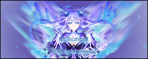
The cleavage chick looks good maybe add a light black brush to the empty space on right and left
SYN MsTwiztid
New member

Done with some help from XDC Browncoat
On this one, remember your rule-of-thirds. Also, try to avoid putting text on the focal. You want it close, but not on top of. Excellent improvement. =)
SYN Ichigo
New member
Sry what is the rule-of-thirds?
SYN MsTwiztid
New member
rule of thirds. Imagine a grid with 2 vertical lines and two horizontal lines making 9 boxes in your canvas. The important aspects of your design, such as the focal and text, should be placed either along these lines, or at an intersection of lines. Basically. =)
SYN Ichigo
New member
Oh ok yeah Browncoat showed me that. We were kinda paying around seeing how it would turn out since her viewpoint was completely centered. 
xxThanatosx89
New member
Idk I kinda like how it looks like she's holding the text
SYN Ichigo
New member
SYN Ichigo
New member
Idk I kinda like how it looks like she's holding the text
Yeah thats what we were going for =)
SYN Ichigo
New member
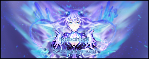
The cleavage chick looks good maybe add a light black brush to the empty space on right and left
How this look?

xxThanatosx89
New member
Better and that also added a little depth 


