[ACCEPTED] XGC STANG APPLICATION

XGC Radioactive

New member
halo.png


get_away.png


first one typical game signature text is there just to show some text blending.

alot more time, and personal creative touch on the second one especially.

if you post [1mg] url [/1mg], the images will actually show up (replace the 1 with an I)
 

VenerealMonkey

New member
Not too bad, make sure when you are resizing an image, hold Shift and drag the corners to keep the proper proportions. Both of these images look horizontally flattened. When I get off work, I will post some tutorials to help u out.
 

SYN STANG

General
when i resize i do the keep proportions. Im not changing the image size down to 500x200 till the very end which is what causes the slight horizontal flattening. Any advice on how to get around that would be awesome! im always open for reviews and constructive criticism. I can honestly say im proud of the second one though. Im still learning, and will never stop.
 

SYN STANG

General
i do resize focal before effects, actually before doing anything else, making sure to keep porportions. then only time it gets weird is the last step when i change the entire image size to 500x200.
 

SYN STANG

General
so... waiting on Ixias for approval? ... i have other stuff but its wayy old and does not reflect my current skills. I lost most of my stuff in a hard drive crash.
 

XGC Radioactive

New member
no. we're waiting on your one week. Ixias doesn't approve. Any one of us have the power to accept or deny.

At this stage we're still trying to decide, and more images would be great! :]
 

XGC Radioactive

New member
then I would suggest making new ones if you would like. Venereal said he's got some tutorials for you when he gets off work.
I look forward to seeing what you can make with one!
 

VenerealMonkey

New member

so this one isn't bad at all. remember when you are looking for a focal, go for a high pixel (good quality) render. There is a lot of negative space on the left side of this sig. you want to have your render as the focal of the sig, not the negative space.

Best thing to do is either enlarge your focal or lower your canvas width a bit. try not to have the canvas narrower than 380px, then it makes the whole sig look square. if you are going to enlarge a render, make sure to do it before you rasterize it. If you rasterize and then enlarge, the image will pixelate and look like the focal in this sig.

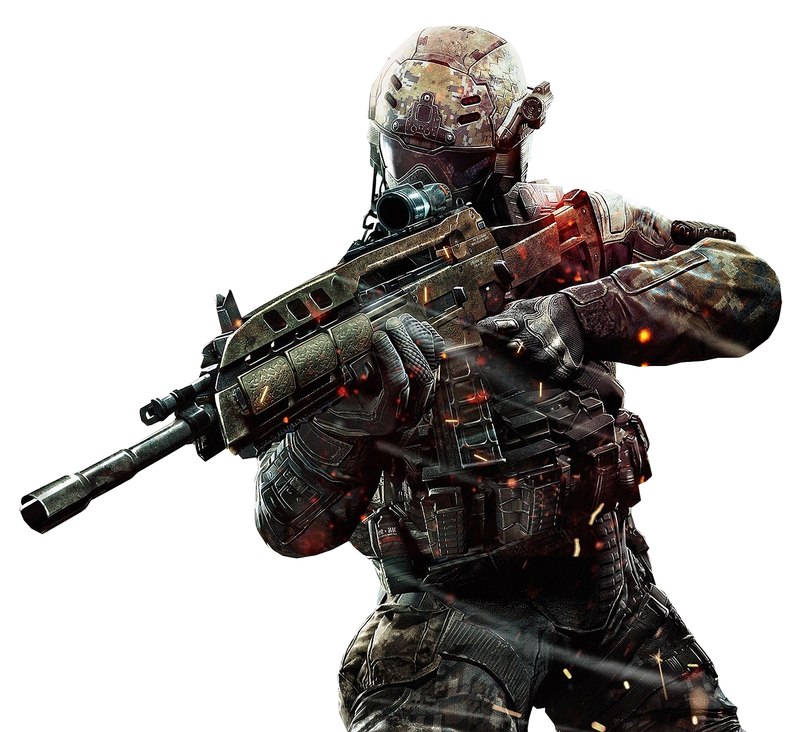
You seem to have a descent handle on what you are doing, so I want you to try this tutorial with the render I am providing. If you get any hiccups with it, let me know and I will guide you through it. I look forward to seeing your product.

http://www.youtube.com/watch?v=B_mtTozZ5G4

cod_black-ops_2.png
 

SYN MsTwiztid

New member
going out on a limb here. This is a thread for a actual signature request that no one has taken on. http://www.xiledgaming.com/showthread.php?222161-Sig-Request-for-LoDHILL27. And this would be my interpretation of what he was looking for.
boxing.png

You really nailed this request. If you could work on the tutorial I posted, maybe using Venereal's Render, that'd be awesome.

I just want to see how well you know the tools of Photoshop before I make a decision on your application. =)
 
Top