[ACCEPTED] XGC XMODELX APPLICATION

SYN Ichigo

New member
Hello XGC xModelx and thank you for applying to the design team. I would like to begin by letting you know that the application process can be long and sometimes a little frustrating. However the members of the design team that will be helping you along this process are will be providing advice and suggestions to help you improve your skills and become an amazing designer.

Throughout your application process we will work with you on techniques such as rule-of-thirds, flow, and blending that will help your signatures go from good to amazing.

Taking a look at the signatures that you submitted, take a look at this link. It shows what the standards are for making signatures on the website such as the max size for a signature.

We look forward to working with you and seeing the designs that you come up with. :D
 

SYN Ichigo

New member
Don't worry about trying to rush your sigs. We want you to take your time with your sigs and produce amazing sigs. Nobody will be upset with you for taking more time to work on a sig. :D And be sure to take a look at that link that I gave you. The max size for a signature on this forum is 500 x 200 and remember when resizing an image make sure you hold shift so that you don't lose the quality of the image.
 

SYN Ichigo

New member
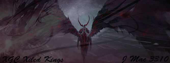
Well other than that the focal on the first one is blended in with the background too much you want you focal to stand out and be what draws the attention of one's eyes. But you don't want it to stand out too much and look like its been pasted onto the background either. Also I would try to get a flow going in the background on this one probably along the direction that his sword is going so that when looking at it people's eyes will flow the path along the sword to the main focal of the sig. Which in most cases the main focal is going to be the characters head.

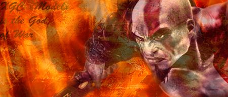
On the second one, I like the idea of have nothing but abstract c4ds in it, but without having an image to use as a focal its hard to set a flow. And when you add in the text it becomes the focal and can take away from the sig IMO. But other than that they are a good start. KIU!
 

SYN Ichigo

New member
xgctestsig1.jpg


This one is definitely looking better. I would suggest when placing an image or gradient map above your focal be sure to erase the part on your focal so to keep the quality of the focal. Really good start. KIU!

As for posting signatures that people ask you to do. It is perfectly fine. We love to see the designs that you come up with. We will give you advice and suggestions about them the same as if they were the test images. As long as your not working on signature requests in the designers area then it is all good. You will be able to work on those once you have been accepted onto the team. :D
 

SYN MsTwiztid

New member
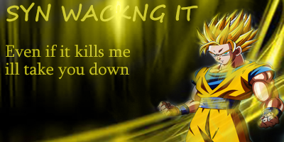
[URL=http://s448.photobucket.com/user/jonakadaze/media/synwackngit.jpg.html] [/URL]

this was just for fun and to practice/play around with some new tools i did not get in contact with him in anyway!!!
let me know what you think

Hey Model!

I'm Ixias, i'm the leader of the Design team. =)

For being brand new to design, you're doing a pretty good job. I took me a good 2 months when i first picked up photoshop before I did anything that was even worth showing off.

The best advice i could give you is to do tutorials. Do tutorials until you're just so sick of them and you feel like you might lose your mind if you look at another one, and then do 5 more!

The more you do, the more techniques and styles you will learn until you can eventually find a style all your own.

Also, if you haven't already, i would suggest reading the thread titled, "Tips for Design Applicants"

It is important to remember that we are here to help you. We will never do anything to harm you or intentionally hurt your feelings. The Criticism that we give you is strictly to help you take your designs to the next level. We are all designers here and we understand that sometimes it's discouraging when you put your heart into something just to have someone else tell you that it could be better.

We will try to give you as much beneficial advice as we can, but we do ask that whenever you are asked to make a change, or redo a signature that you comply and fix the issue. That's how we know that you are learning from what we are teaching you!

Now, with this signature that you posted, there are a few things off bout it.

The very first thing i notice is your text! It's very very big and takes up a lot of space. You never want to try to fill your negative space with text. It draws far too much attention away from your focal and sends your eyes in multiple directions. Over all, it's just not very pleasant to the viewer.

Also, you don't want your text to be too fancy. The signature is about your render or your stock. That's your focal. Not your text.

The next thing i notice is your color. Your back ground is black and white, yet your focal and your effects are yellow. You always want to try to pick a color from your focal when creating backgrounds.
color.png

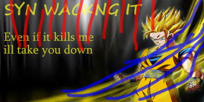
The 3rd thing that pops out is your flow. You've got it all crazy here. Your black and white background has vertical lines, but your render and effects have more of a diagonal flow. The red in this image denotes the flow going the wrong way, the blue denotes the way the render and effects naturally flow.
flow.png

My eyes can't decide what direction they need to go, nor what they should look at first.

The 4th thing that throws it off is the focal looks distorted. When you are sizing your focal down to fit in your canvas, make sure you are holding down the shift key. This will keep it proportionate and not distorted.
 

SYN MsTwiztid

New member
The fifth thing is your Rule of Thirds. This is something that a few people struggle with, but hopefully we can work it out for you.

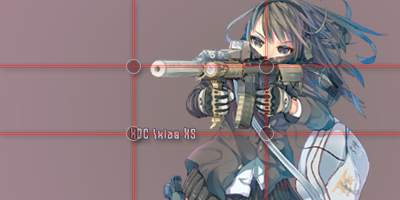
The Rule of Thirds suggests that an image should be imagined as if it were divided into nine equal parts by two equally-spaced horizontal lines and two equally-spaced vertical lines, and that important compositional elements should be placed along these lines or their intersections.

Here's an example:

rule-of-thirds-1.png


My focal is lined up on the right vertical line. And the gun she is holding is set along the top horiztonal line. Also, my text is placed on the bottom horizontal line and starts where the bottom and the left line intersect.

My text is also close to my focal. This creates kind of a bridge from the text to the focal. It's easy for the eye to read the text and then just glide right on over to rest. We read left to right, so that's the effect I've set up in this one.

You'll also notice that my text is smaller and i picked a color that make it a bit more faded. This is so that i don't draw too much attention away from the focal.

Now, this isn't a complete signature. This is just a render and some text, but you get the idea of placement from it.


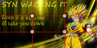
With your image, the Rule of Thirds would be placed like this:

rule-of-thirds-2.png


None of the important aspects of your signature fall on these lines. That's something that you want to try to work on in the future.


There are quite a few more things that we need to work on, but let's start with these. I don't want to overwhelm you.

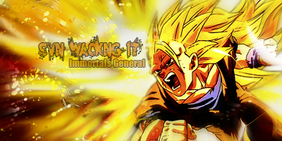
Here is a DBZ signature that i did just today so you can kind of compare it.

synwackingit.png


This is definitely not my best signature, but you can tell that I kept with one flow and one color. The text is a little on the big side, but i tried to pick a color that blended well with the background but still stood out enough to be read.

You'll also notice that there's not a lot of negative space. this is because i expanded my effects to reach throughout the entire canvas.


I hope all of this helps you. =)
 
Top