[ACCEPTED] XGC XMODELX APPLICATION

XGC xModelx

New member
a lil bit more cnc would help i kinda feel as other apps are more importent
just saying what i think dont take this the wrong way please thanks
 

IXssl

New member
The sig looks good but I would try blending Raiden in a lil more take the blur tool and lower the opacity to about 15 to 20% and blur the edges also the side text is just throwing me off a lil bit it just doesn't look right at least on signature it doesn't look good. I would try using another color on the text maybe using the color from the render and setting the opacity down between 60 to 75 your choice also have the text as close to the render as possible with the opacity down having it on the side is honestly throwing off the whole sig since its so far apart. Aside from text placement, text color and blending the sig is very good bro. Good job, hope that was enough cnc for you!
 

IXssl

New member
Also when you add the render this is just something I do but I make 5 copies of it then use Gausian blur on 4 of the 5 renders with the blur set to 5.0 it helps with blurring the render. Also once you blur the renders take the sharpen tool and sharpen it a bit, And I usually mess with the Gradient maps once I have the sig essentially "done" I make a new layer, apply the image then go to gradient maps and mess with the different types also photo filter helps allot with getting a good "glow" as I say it or a even shading around the whole signature. I would try to just mess around with different things. Hope that helps bro.
 

IXssl

New member
also to add to that you might want to off center the Deadpool render just a bit maybe to the left a bit and shrink your text a bit use about 12 font also i don't know if you know about dafont.com but you can download some cool text from there that can go well with the sig. I hope this was helpful a bit.
 

IXssl

New member
I think it gives it a good grimey animated comic look I like the whole sig but thats just me personally if you just do those minor changes that sig will be off the hook bro. Just make sure to not divert from the rule of thirds too much because then some sigs that aren't meant to be in the middle will make it look off and not look as good as it could be. Oh and make sure to lower the opacity on the text if you haven't bro you don't want too much attention drawn to your text and not to the render itself.
 

XGC xModelx

New member
yeah i tried to off set it butt it did not look good to me i was making it for myself so i wanted to make sure i liked it and the text it at like 54
 

XDC Mich2k

New member

i think this is my best real person so far

I don't believe you are re sizing them correctly, Make sure to hold shift on a corner while re sizing, Take this for example
9238244332_78eef5608f_o.png
and compare this to yours. You resized it a bit odd, She also look quite pale, Now mine i messed with her color but if you go back the the original photo shes has more color. Other than that its looking good.
 

SYN MsTwiztid

New member
Your backgrounds are really blurry, and not the, "I'm creating depth" kind of blurry. Make sure that the effects you are using are high quality and not low quality.

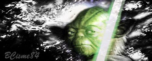
Also, with the Yoda signature, you don't want to have a black and white background with a colorful focal. It doesn't look right. You want your background to be a color that compliments your focal.

 

XGC xModelx

New member
Yoda one is what he wanted if you go to my profile the one that did ask on my profile loved them tho and ill post some new ones tonight post some more when I get off work
 

XGC xModelx

New member
[URL="

[URL="

[URL="

Sorry i have not posted in a few days all 3 is stuff i was working on blending and shading and layers let me know what you think p.s i know the j mac text is messed up :)
 
Last edited:
Top