- Forums
- XILED TEAMS
- DESIGN & EVENTS TEAMS
- DESIGN TEAM
- DESIGN TRAINING GROUNDS
- TRAINING GROUNDS HISTORY
You are using an out of date browser. It may not display this or other websites correctly.
You should upgrade or use an alternative browser.
You should upgrade or use an alternative browser.
FINISHED WEEK'S
- Thread starter Snyder GFX
- Start date
XDC KiLLaCam
New member
thanks i didnt notice 
I WONA BURRITO
New member
I dont think anything needs to be said about the first one any more..
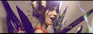
The second one however. IMO.. I think that c4d in the top right is distracting as hell and the part over her chin as well.
The second one however. IMO.. I think that c4d in the top right is distracting as hell and the part over her chin as well.
I WONA BURRITO
New member
ummm did you happen to sharpen the background before the final.. it looks kinda gritty ?
xxThanatosx89
New member
Where do y'all get your stocks from???
SYN Last Laugh
New member
CurinoItaliana
New member
ty  btw congrats on last weeks sig..looked really good
SYN Last Laugh
New member
That I had done intentionally to give it a contrast to the other colors, and help with her blue hair band. I see what you are saying, though. I'll mess with it and see which way seems to give it a better feel.
Snyder GFX
New member
i like what you originally had way to try something different i would have made the rectangles smaller and clipping masked them now you have too much and it looks rushed


